menu
Guest Check
date
Todaytable
3server
shannonnumber
2008–-
QtyItem$
-
16Product Design Appetizers16000
-
1First course: BPO Manager10000
-
1Second course: Drop-in10000
-
1Design system side dish5000
-
1Dessert: Standard American Playing Cards2500
-
15Digestif: Type, Lettering & LogosFreeee
-
-
Check receipt
*** Shannon Miwa ***
sheriff@onehorse.town | (415) 508 8205 | Seattle, WA
http://onehorse.town
Senior Product Designer with 13+ years of experience across SaaS,
fintech, and enterprise platforms.
Proven track record leading complex 0-to-1 product builds,
establishing and scaling design systems, and driving
cross-functional alignment between product, engineering, and
business stakeholders. Skilled in end-to-end UX, from discovery and
user research through high-fidelity prototyping and production, with
a strong background in design strategy, mentorship, and emphasis on
systems thinking.
Design tools:
Claude Code, Replit, Figma, Figma Make, Sketch, Zeplin, InVision, Adobe Creative Suite, prompting, layout, typography, lettering
Design Systems:Component libraries, design tokens, documentation, scalable pattern creation
UX methods:User research, usability testing, A/B testing, journey mapping, user flows, wireframing, rapid prototyping, information architecture
Accessibility:WCAG 2.1 AA compliance, inclusive design principles, empathy, caring about other people
Collaboration:Linear, Jira, Notion, Miro, FigJam, Confluence, Slack, running meetings, talking to people, reaching out, sharing
Technical:HTML, CSS, JavaScript (working knowledge), Git, Github, a dash of Python, VIM
Leadership:Design strategy, OKR alignment, mentorship, stakeholder management, product roadmapping, product direction
Professional Experience
Date
Freelance Product Designer & Creative
Beautiful Stupid Things (Independent practice)
June 2024 to present
- Pursuing independent creative and design projects, maintaining active design practice across UX, visual design, and craft disciplines
- Expanding skill set in physical design mediums including ceramics and textile work, deepening perspective on materials, process, and user interaction
- Maintaining an active writing practice
- Exploring AI tooling; Replit, Claude Code, Loveable, Figma Make
Senior Product Designer
Assembled
May 2022 to June 2024
- Led visual and experience design expression across product suite, establishing design standards and supporting other designers in design decisions
- Identified gaps and opportunities in user team experience, advocating for high-impact problems and driving product strategy
- Served as primary design consult for Assembled's first AI product
- Drove design process through definition, ideation, concept development, validation, wireframing, prototyping, and final visual design in quick iterative cycles
- Designed two ground-up products from 0 to launch in collaboration with large enterprise clients, owning some of the most complex design challenges
- Collaborated closely with product managers, engineering, marketing, and operations teams to deliver user-centered solutions
- Grew and implemented design system, identifying opportunities to improve processes that contributed to stronger design organization
- Mentored and led junior designers through pairing and collaborative practices, building strong team culture
- Managed extensive stakeholder relationships with enterprise clients, articulating design decisions and conducting discovery sessions
- Assumed product management responsibilities during team gaps, balancing business goals with user needs
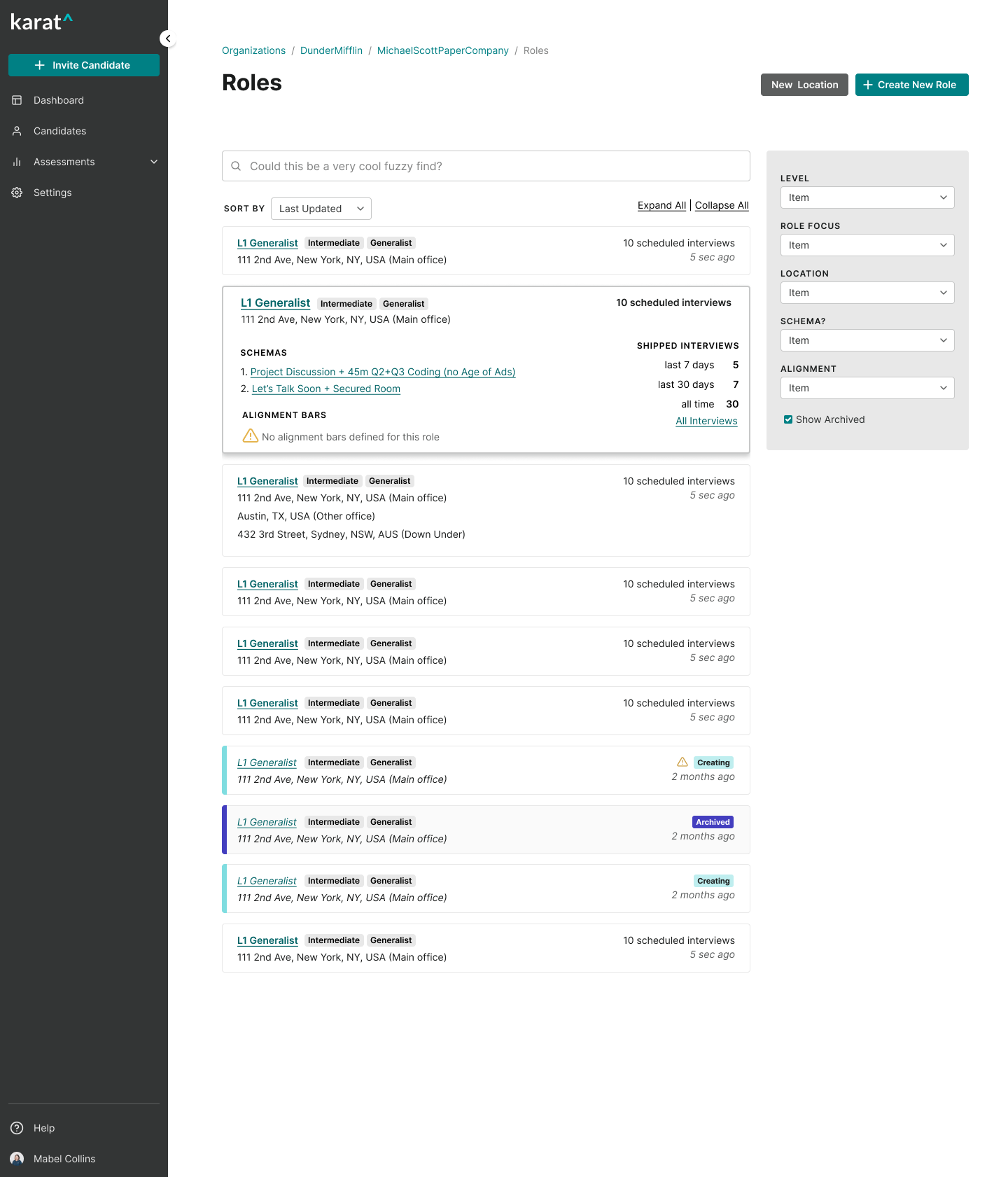
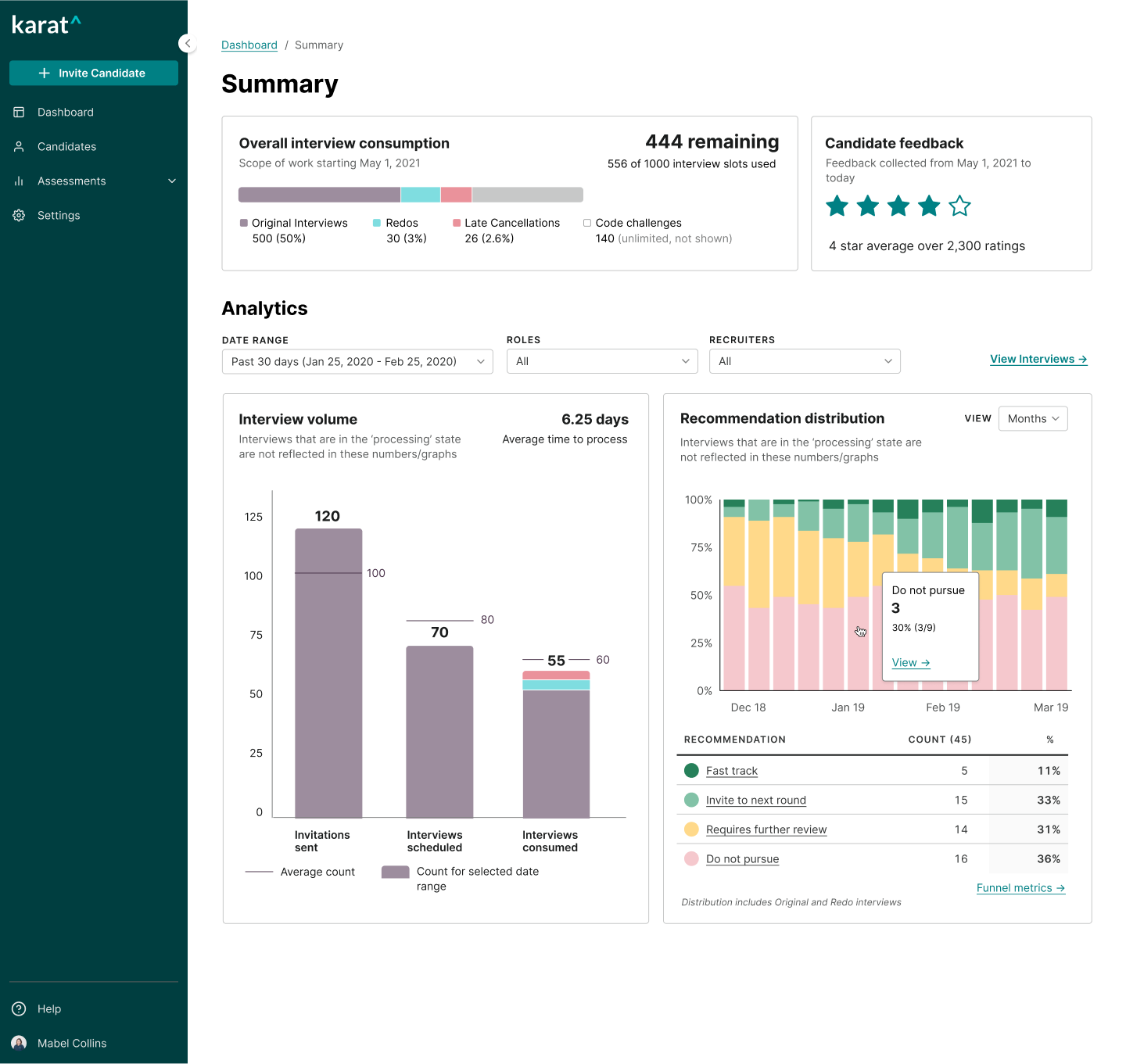
Senior Product Designer
Karat
March 2020 to April 2022
- Served as one of two designers supporting 30+ person product organization, leading highly complex projects independently
- Used user-centered design methodologies to craft designs connecting user needs, data, and business goals across end-to-end experience
- Built consistency across main product through iterative design cycles, upgrading legacy features to cohesive design language
- Developed and maintained growing design system, creating scalable components and comprehensive documentation
- Collaborated closely with engineering teams, pairing with back-end engineers and writing production CSS for pixel-perfect implementation
- Organized communications and improved workflows, identifying process improvements for design organization
- Designed and launched new features using rapid prototyping and validation to inform design decisions
Senior Product Designer
Braintree (Paypal)
August 2015 to April 2019
- Led design as one of three designers on sites team, tackling complex design challenges for developer-facing products
- Drove 2-year redesign of legacy product through full design process from concept development to launch, improving merchant experience helping process millions of dollars annually
- Conducted user research with developers, using insights to identify opportunities and advocate for user-centered improvements
- Enhanced information architecture for documentation and marketing, balancing user needs with business goals
- Collaborated with cross-functional partners including engineering, product, and support to deliver cohesive solutions
- Assumed product management work, articulating design decisions and managing stakeholder expectations
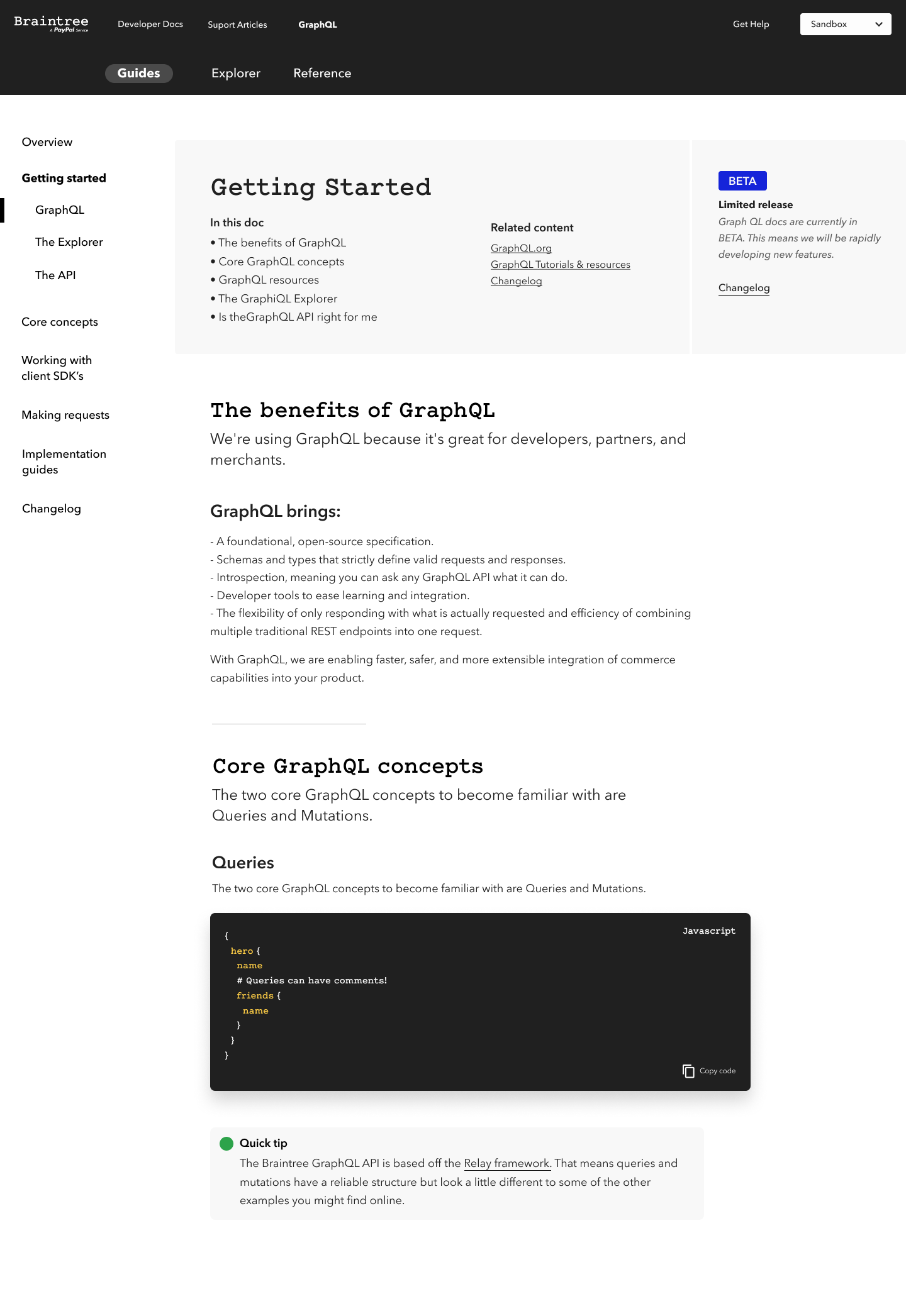
- Designed and launched next-generation GraphQL documentation through iterative cycles of validation and refinement
- Initiated Braintree's first design system, establishing foundations for scalable, consistent design expression
Creative Developer
Software for Good
January 2014 to January 2015
- Built frontend experiences using HTML, CSS, and JavaScript, collaborating with partners to deliver user-centered solutions
- Developed PHP and JavaScript skills through iterative development cycles for client projects
- Provided design support for clients without dedicated designers, driving design process from concept to launch
- Created web application using APIs to process donations, balancing user needs with technical constraints
Designer
Swayspace
August 2008 to August 2013
- Designed comprehensive range of work including, but not limited to, wedding invitations, branding, advertising, and web applications for diverse clients
- Created web and mobile application designs for large banking clients, balancing user experience with business goals
- Designed and coded websites, managing stakeholder relationships and articulating design decisions
- Led design process from concept development through production for letterpress printed materials
- Prepared detailed files for print production, ordered paper and supplies
- Project managed letterpress shop operations, identifying process improvements and coordinating production and client communications
A Handful of Tasters
TL;DR I've done a lot of product design! Some quick and dirty screenshots of end or mid-states for a range of product work if you're in a hurry.
See the Pen LMqRWg by shannpersand (@shannpersand) on CodePen.
See the Pen make this stupid dropdown flexy work by shannpersand (@shannpersand) on CodePen.
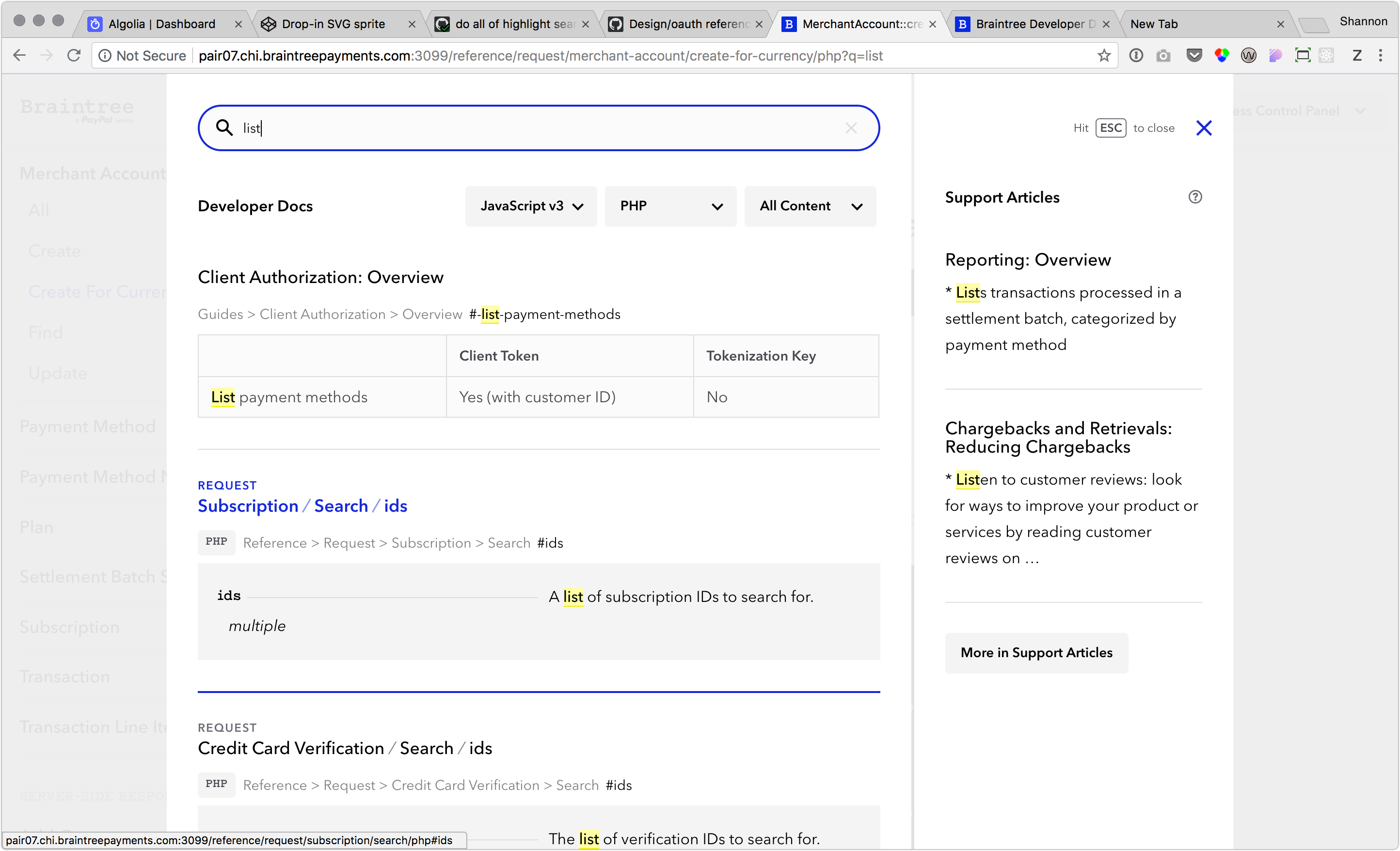
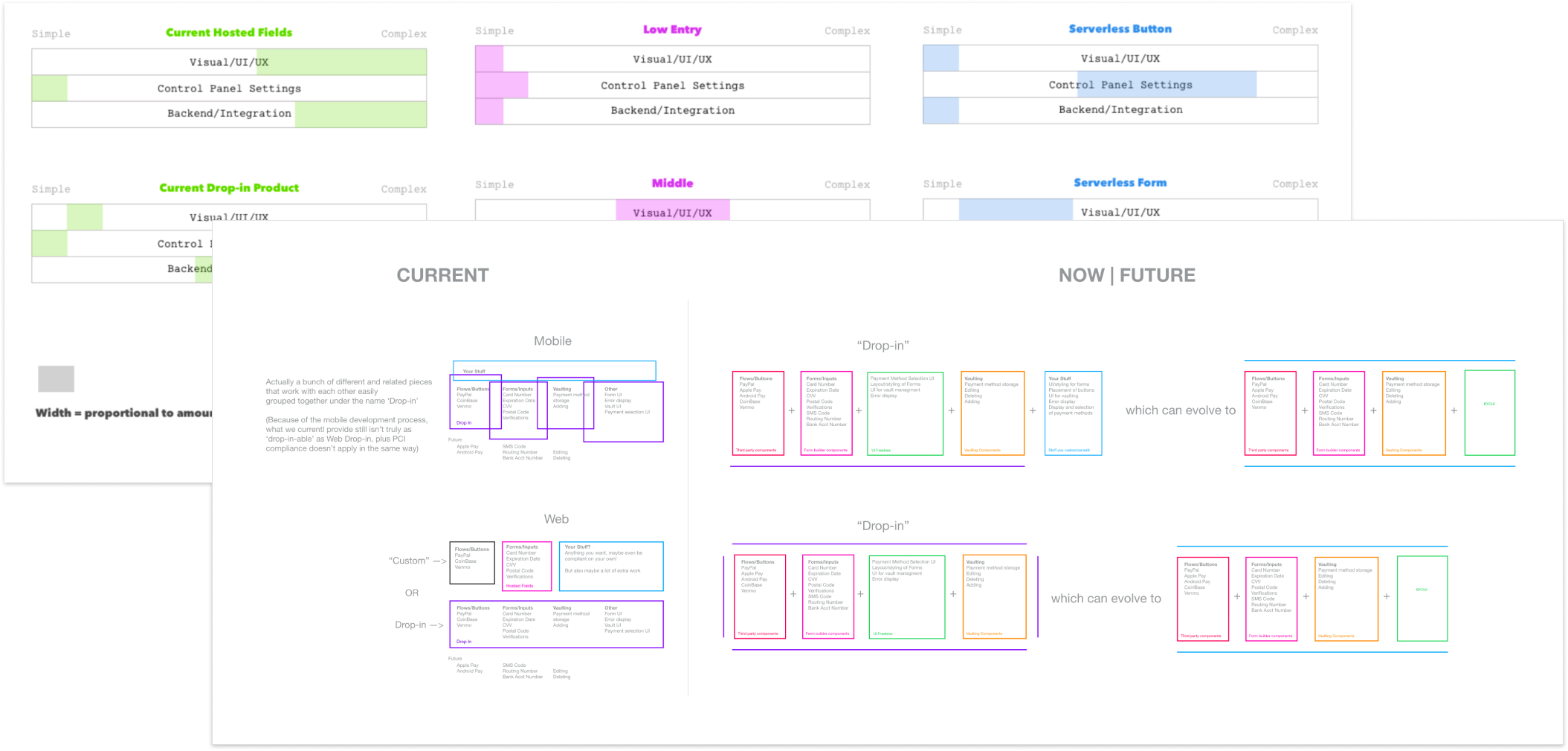
Drop-in: Case Study
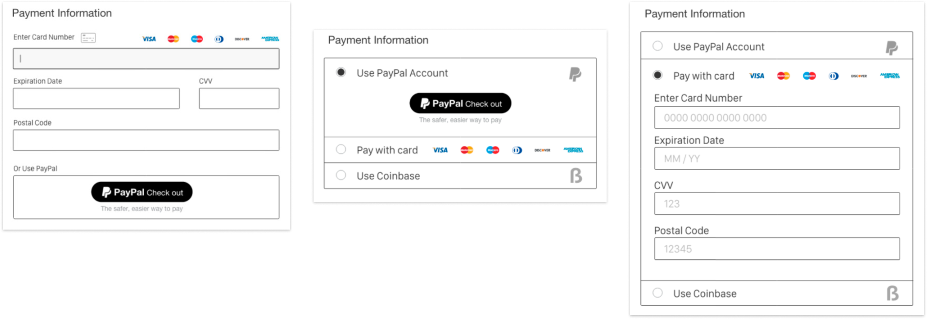
At Braintree, I was tasked with leading the ground up redesign of a legacy product called Drop-In UI: a widely used product that gave merchants ready-to-use PCI compliant credit card forms that blended into their own checkouts. I headed this 2 year project at Braintree handling a wide range of design tasks and collaborations in addition to overseeing the product schedule and release.
Responsibilities
- Lead designer
- Product planning
- User research
- Design work
- PM duties
- Production CSS
- Product rollout
Team
- 3 Designers
- 6 Engineers
- Engineering manager
- Head of Developer Experience
- PayPal UX Research Lab
- PMM and marketing
Product Impact
- Drop-In UI continued processing millions in revenue annually
- Existing clients upgraded and were instantly able to accept multiple new payment methods
- Improved user workflow, accessibility, and eliminated previous confusion
- Allowed mobile apps to take advantage of easy, secure payment acceptance
- Still. In. Use. (6 years later!)
The original Drop-in was an isolated iframe that merchants could include on their website as a snippet of code, with a bit of integration. It was a product meant to have a low bar for entry which would allow merchants to accept payments easily while not having to go through a lengthy compliance process, and included both a web and mobile version.
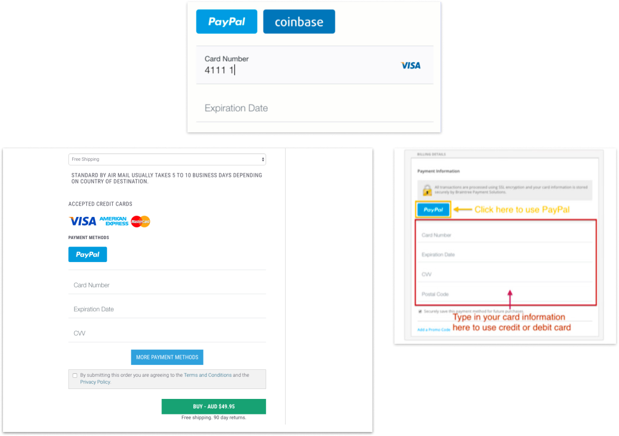
This was great for merchants, but for Drop-in users, the interface for Drop-in was fairly confusing. There were no clear input borders and the design was pretty opinionated, it didn't always mesh with Merchant's websites. Some Merchants were even sending out annotated screenshots to their customers explaining how to pay.
I spent much of the first part of the project working on product and feature placement within the Braintree/PayPal ecosystem. There was a lot of research done on how the product could coexist with others and whether it should just be killed.
During this time we were able to establish that the product was actually doing quite a bit of volume and did have brand name recognition, both factors that pushed for a redesign rather than a sunsetting.
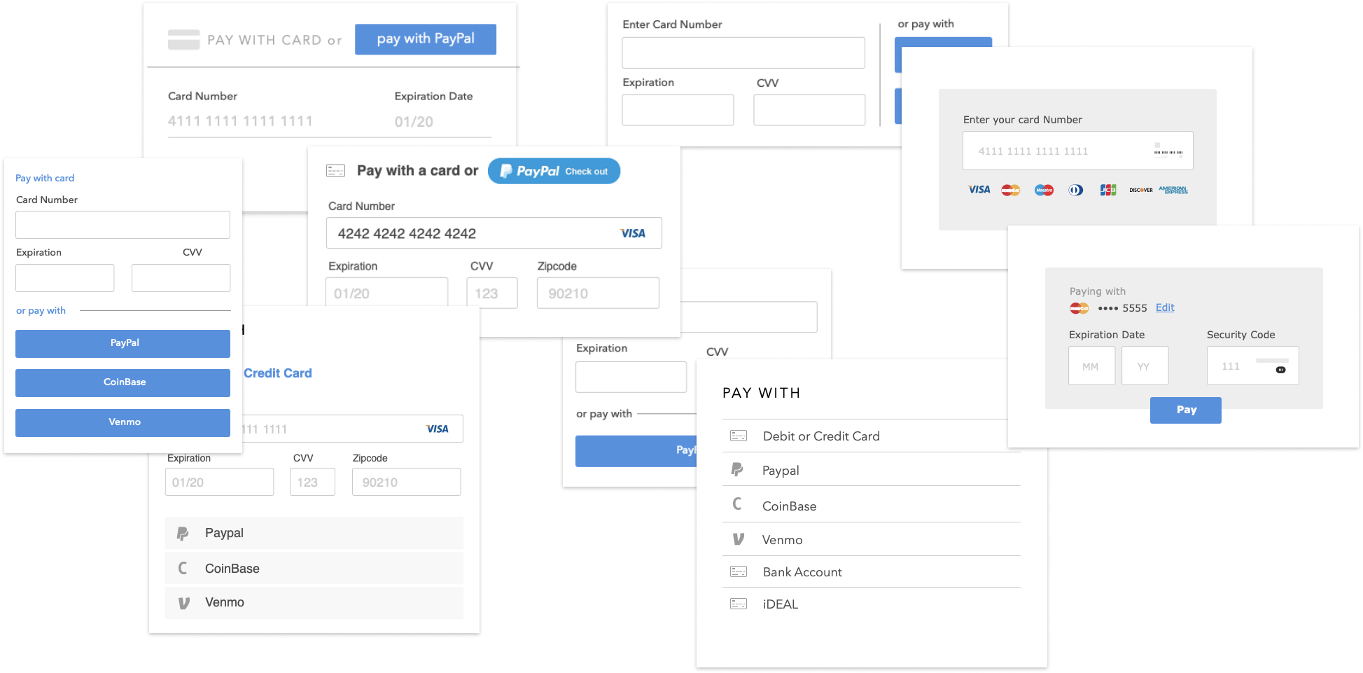
Due to timelines and engineer availability, we chose to refresh the mobile version of Drop-in first. The issues with the mobile version were fairly straightforward, we needed mainly to clean a few usability issues up and also accommodate more payment method options.
After lots of testing of different layouts and styling, we settled relatively quickly on something that fit with existing iOS and Android system styles. We then spent time to refresh the credit card form and built a custom keyboard for expiration date input.
We ran the mobile version through more usability testing and prepared the mobile version for release.
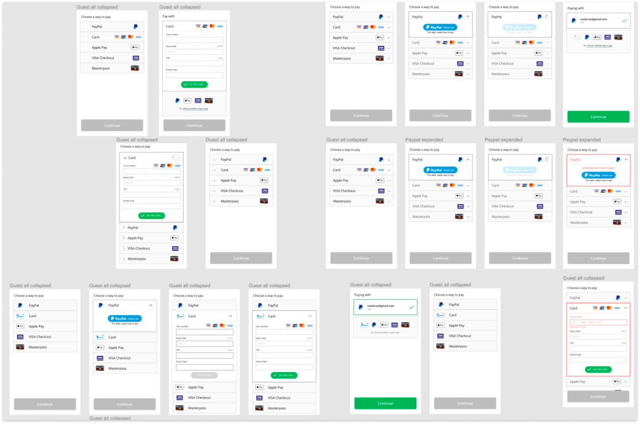
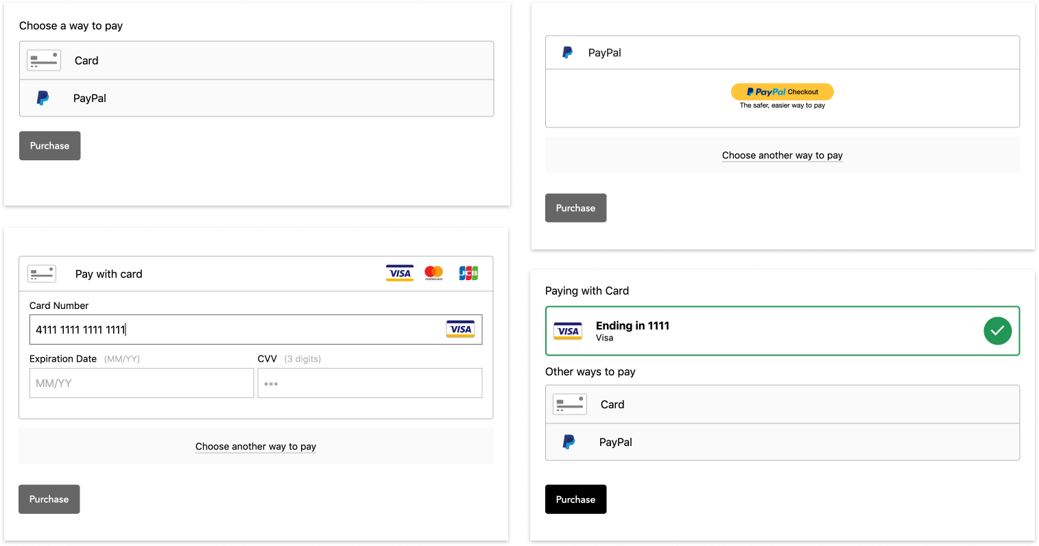
While the mobile redesign clipped along at a fairly quick pace and was pretty straightforward in terms of design decisions, when it came to tackling the web version, the story was quite different.
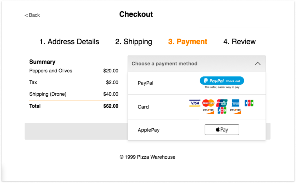
I spent the initial sketch phase working on the issues of usability with the first version, and also on the scaling problem that had by this time become more urgent. ApplePay, VisaCheckout, and GooglePay had all recently launched and merchants wanted to easily accept whatever methods were available.
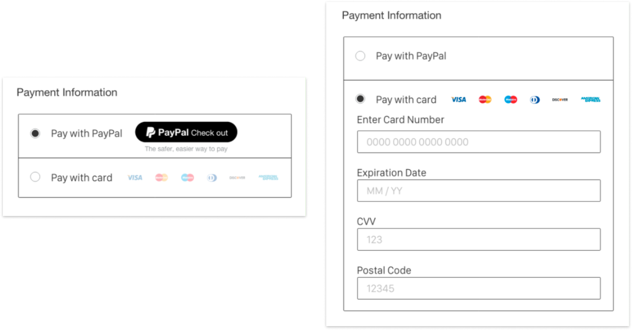
We settled on a fancy customized dropdown as the main design direction. This was in order to minimize the space on the Merchant's checkout and be less of an obtrusive element on the page. There were two main directions we tested, one that was a two step process and another that could be a one step process.
The two step process had the advantage of funneling the user down a path and removing distraction, and the single step process had the advantage of speed.
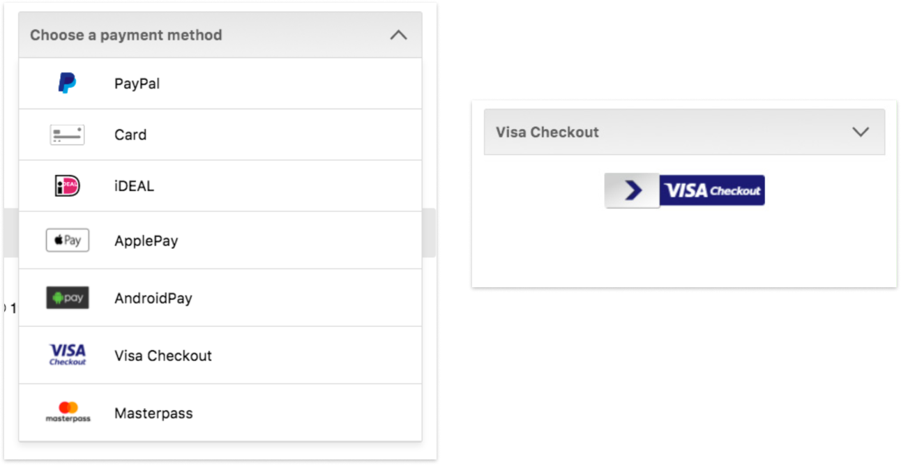
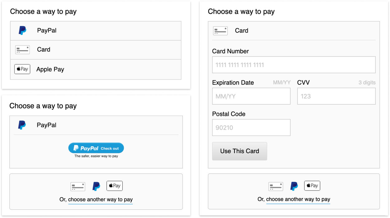
Between user testing and speaking with the consumer group at PayPal, we found that though usability wise there were no issues with the dropdown, there were other considerations that would affect the design. There was a cognitive cost for a user to open a dropdown, not knowing what is under it and needing to parse out that information.
So, we stepped back and did a little loop into some earlier sketches that were based more on a radio/accordion selection process. We re-used the idea of funneling the user down a path for clarity from the dropdown approach, but refined it so that Drop-in now behaved more like an isolated widget all to itself.
Then, we tested the shit out of that version. We built a little fake store with all the directions in them and ran users through different flows getting them to complete checkouts in various ways to make sure there were no issues.
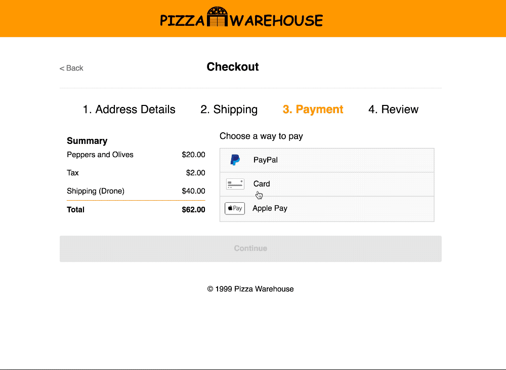
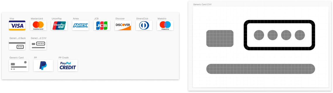
We also did what we could to prep Drop-in for as many possible situations, including a mobile-web version for small screens or spaces, and dialed in assets that would be served by Braintree.
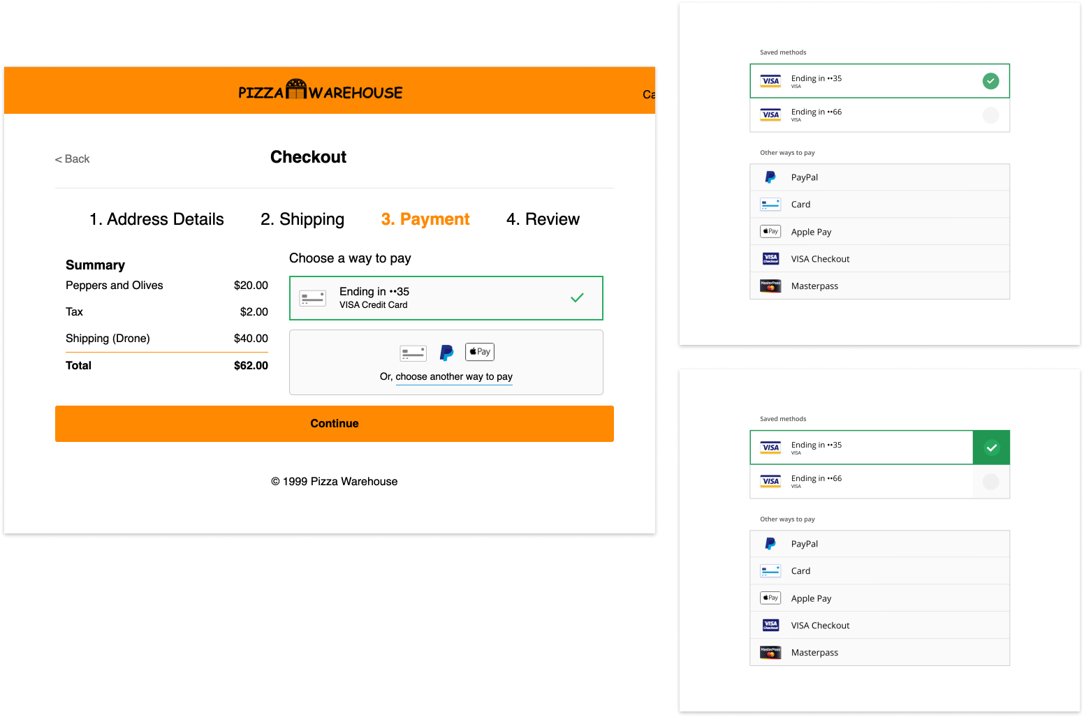
Throughout all this, we were busy refining, refining, refining. The aesthetic got closer and closer to something that was both modern but generic enough to sit on a wide range of pages, and after all the detailing down to making it IE9 compatible were tightened up, we were ready for release.
Finally, we hit release after all the perfecting. There was so much more to this than just pushing the code, we needed to create assets and documentation for the new version, tutorials and work with marketing to adjust the website, not to mention communicate to account managers the need for Merchants to upgrade their versions, no small task.
We got Merchants processing millions of dollars to upgrade, and most of our top selling Drop-in Merchants updated to the 2.0 version. Since release, even more payment methods have been added, and Drop-in handles that scaling beautifully.
A lot of time and effort went into this redesign, and the ups and downs all led to an incredibly solid end product. The redesign of a product doing millions of dollars in transactions was not a light undertaking, but the work paid off for digital longevity. It's tough sometimes working with digital products that may be completely erased in a month or two, but I'm delighted to say the other day (in 2025) I went to buy Girl Scout cookies online and came across and had the honor of paying through my old friend, Drop-In UI.
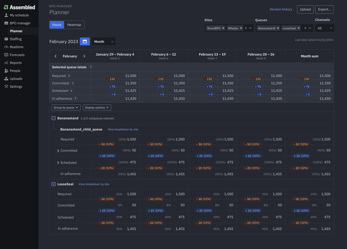
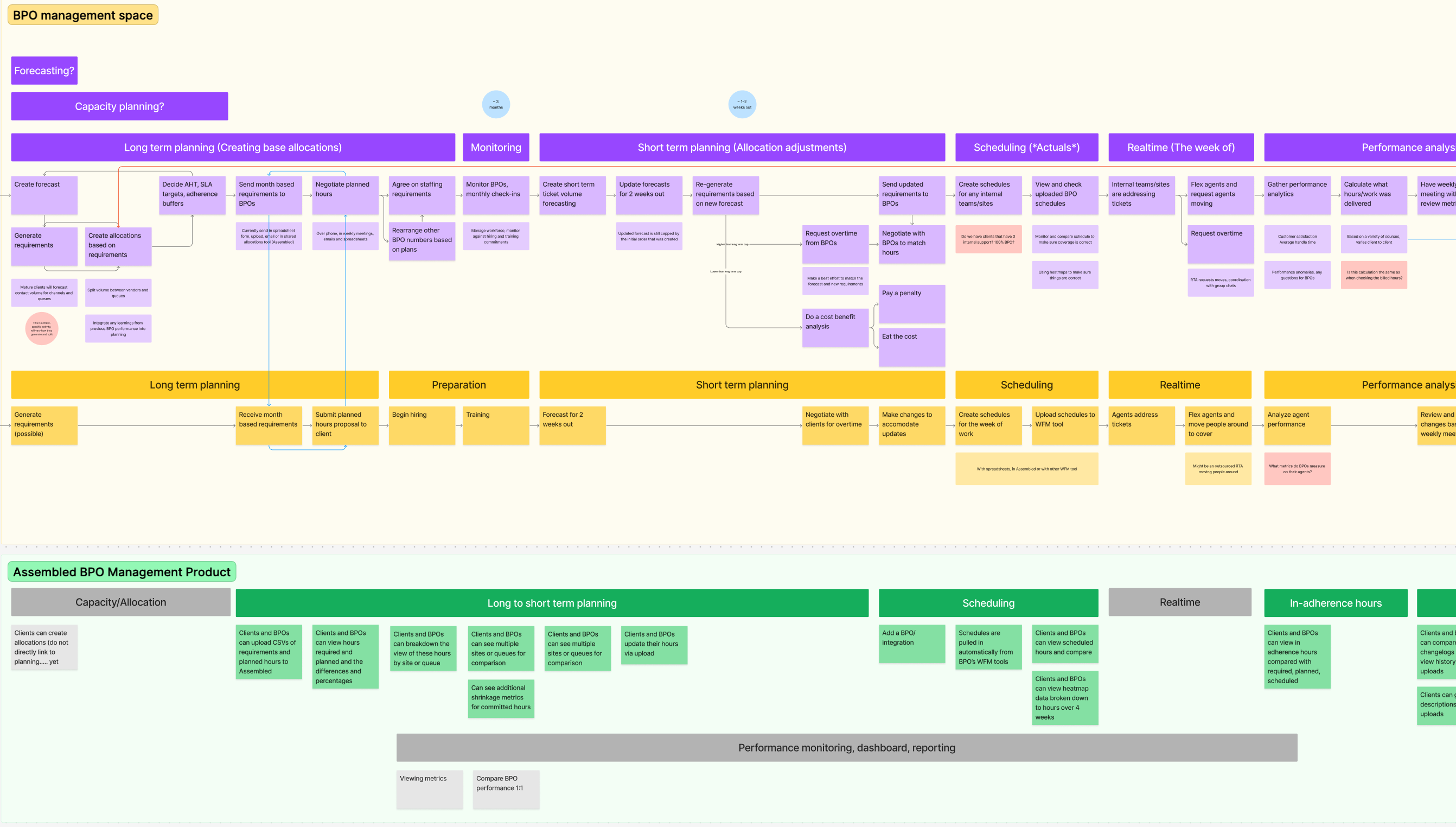
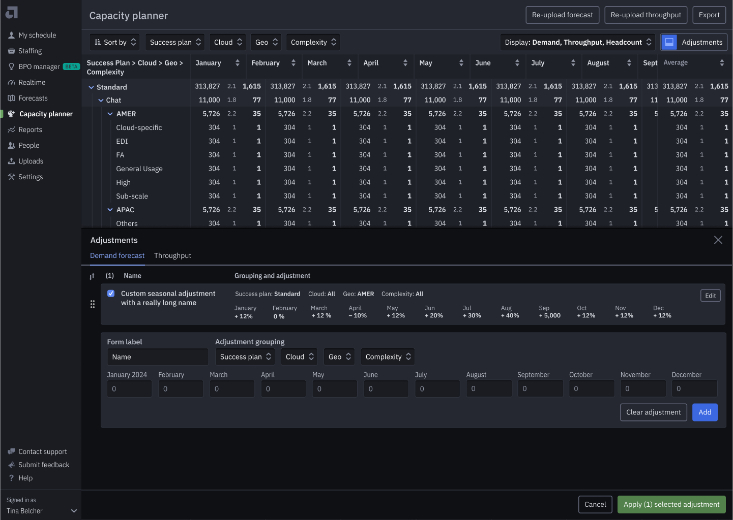
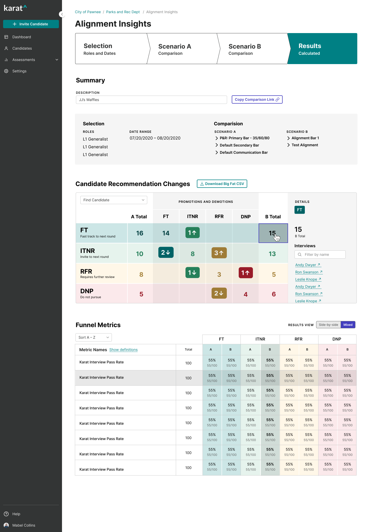
BPO Manager: Case Study
I served as the design lead for the ideation, design, and launch of Assembled’s first expansion product: management tooling for Business Process Outsourcing (BPOs), essentially third party providers. This product was the first of it’s kind in the workforce management space. It tackled problems competitors did not, and allowed Assembled to maintain existing clients, sell to new ones, and compete on an enterprise level.
Responsibilities
- Lead designer
- User research
- Design work
- Herding cats
- Production CSS
- Client collaboration
- Product rollout
Team
- PM
- 6–8 Engineers
- SME
- Account manager
- PMM
- Many, many client stakeholders
Product Impact
- Maintained churn-risk Stripe as a major client, strengthened relationship
- Onboarded Robinhood and expanded product capabilities
- Onboarded new clients and upsold existing ones
- Helped land 1M Salesforce contract as proof of concept for co-developing with clients
- Successfully launched to GA as Assembled's Vendor Management tool
The project started as an emergency churn-risk meeting, and I was pulled in to sketch out wireframes for a new product I'd heard nothing about previously.
In that meeting, I learned there were these companies called BPOs (Business Process Outsourcing) that clients were using. Essentially, Stripe had a lot of BPOs (also referred to as vendors) who were providing some of their customer service. Often a client would need BPO coverage for customer service for a variety of reasons, perhaps covering different languages, timezones, or outsourcing the less technical support questions.
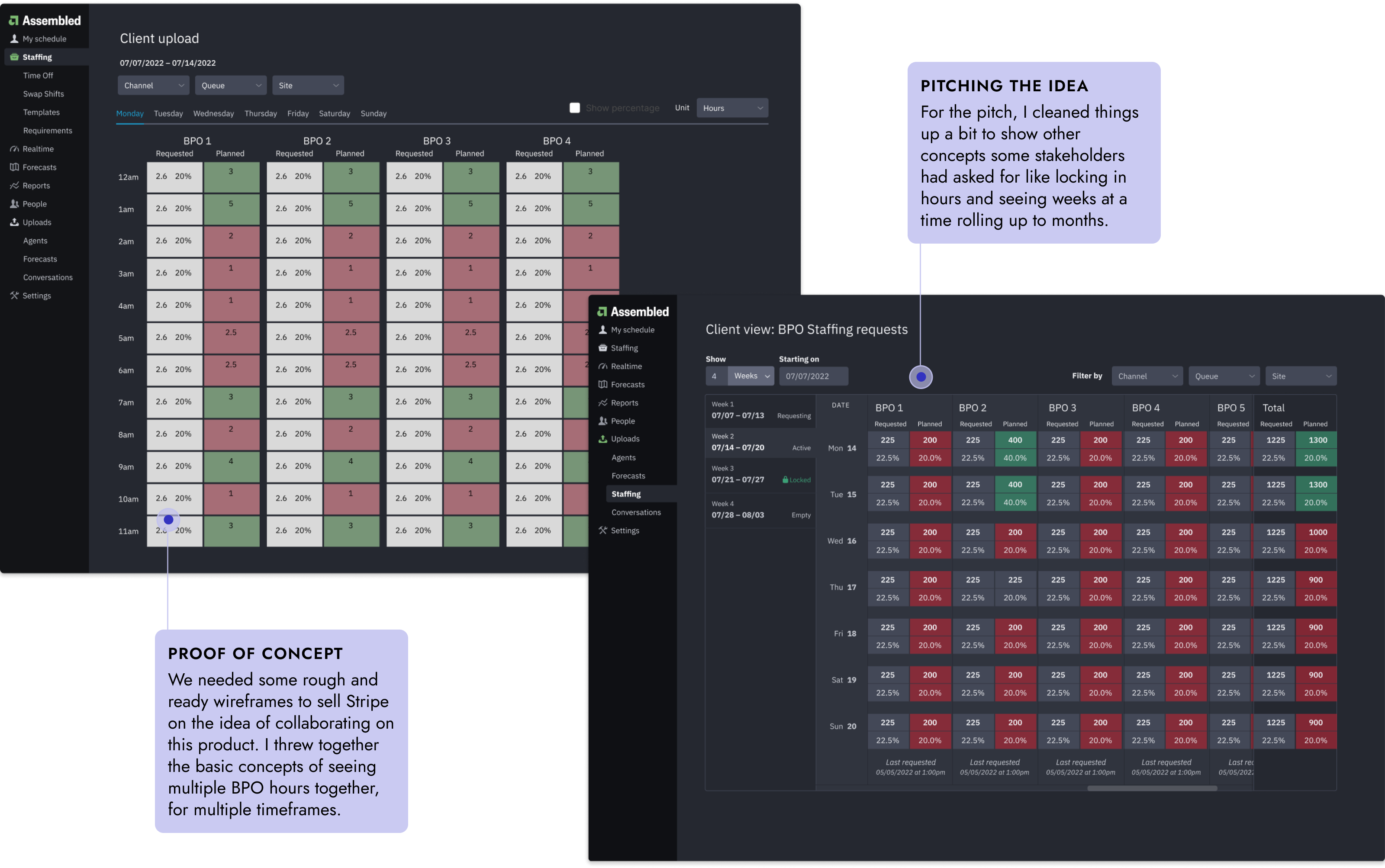
After pitching the idea to Stripe of collaborating on a new product for managing BPOs, we realized we needed to back up and really get a team and data sorted. We set out for Ireland to meet with the users and SMEs to really understand their process.
It turned out that everyone had a slightly different understanding of how the BPO process worked, so I got everyone in a room with post-its to figure out exactly what the end-to-end workflow was. The result was a big and complicated diagram that served as a touchpoint throughout the project.
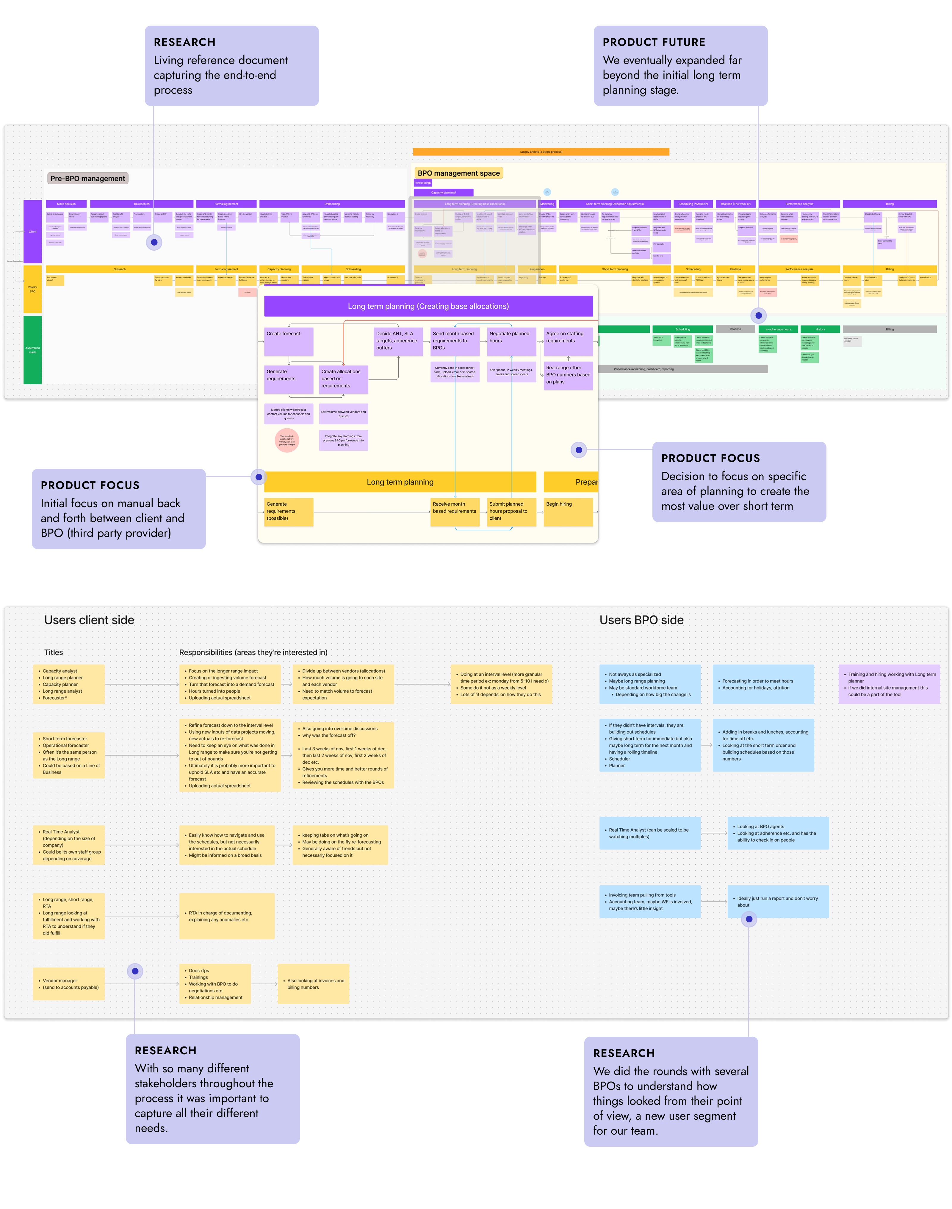
Once we returned from Ireland, I jumped into design mode. Working from both the new flow diagram and some requirements we'd gathered, I started roughing out the layout for what we began calling the Vendor Management Product. I used a storytelling technique to refine the requirements and create a bridge between text and design to get a more detailed view of functionality.
The idea of the product was to create a single source of truth for client and vendor. This would allow them each to request a certain amount of work and commit to a certain hour of work, therefore providing a transparency and history that could be billed/negotiated on later.
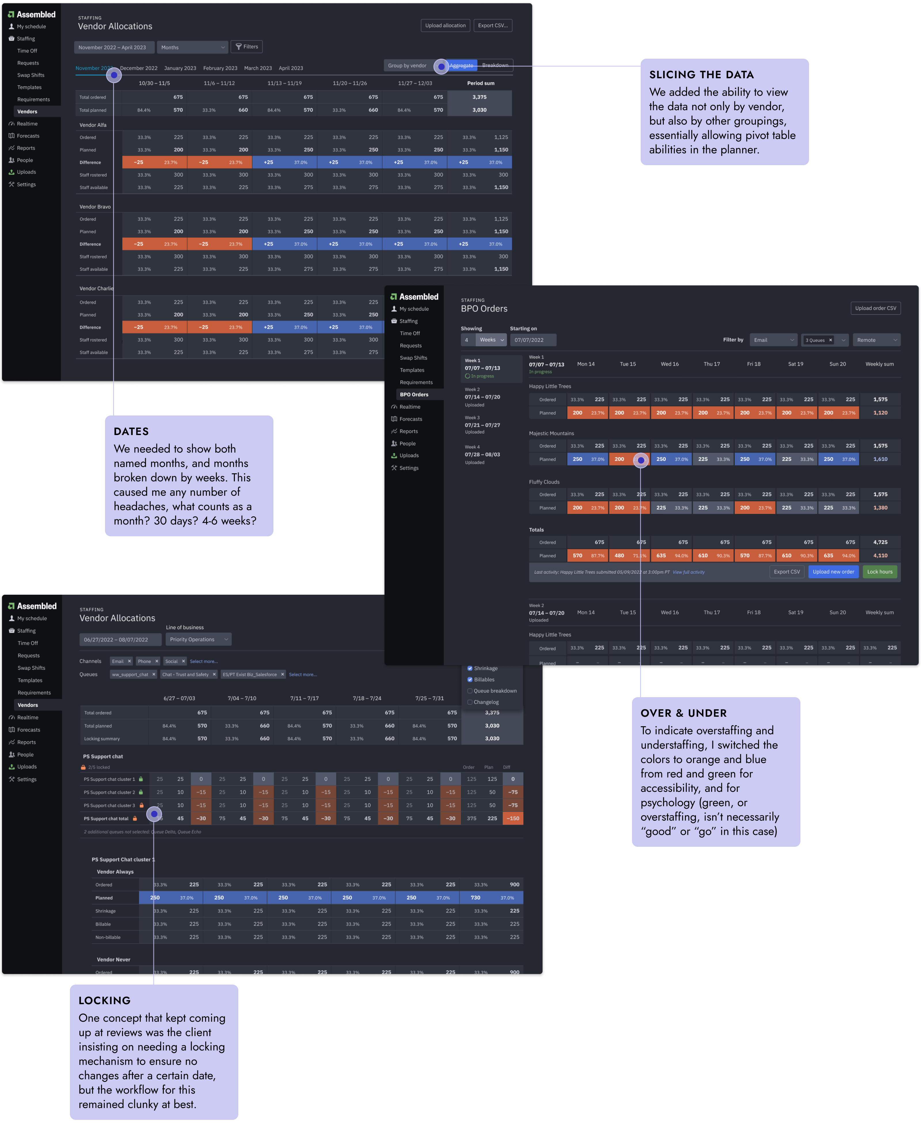
There was quite a bit of iteration in this phase. There were many new concepts that needed to be fit into our existing product in order to replace Stripes spreadsheets. Simple seeming things like having a time breakdown of being able to view months and weeks quickly exposed complications of concepts, is a month 30 days or does it vary or is it 4 weeks? 5 weeks? 6 weeks?
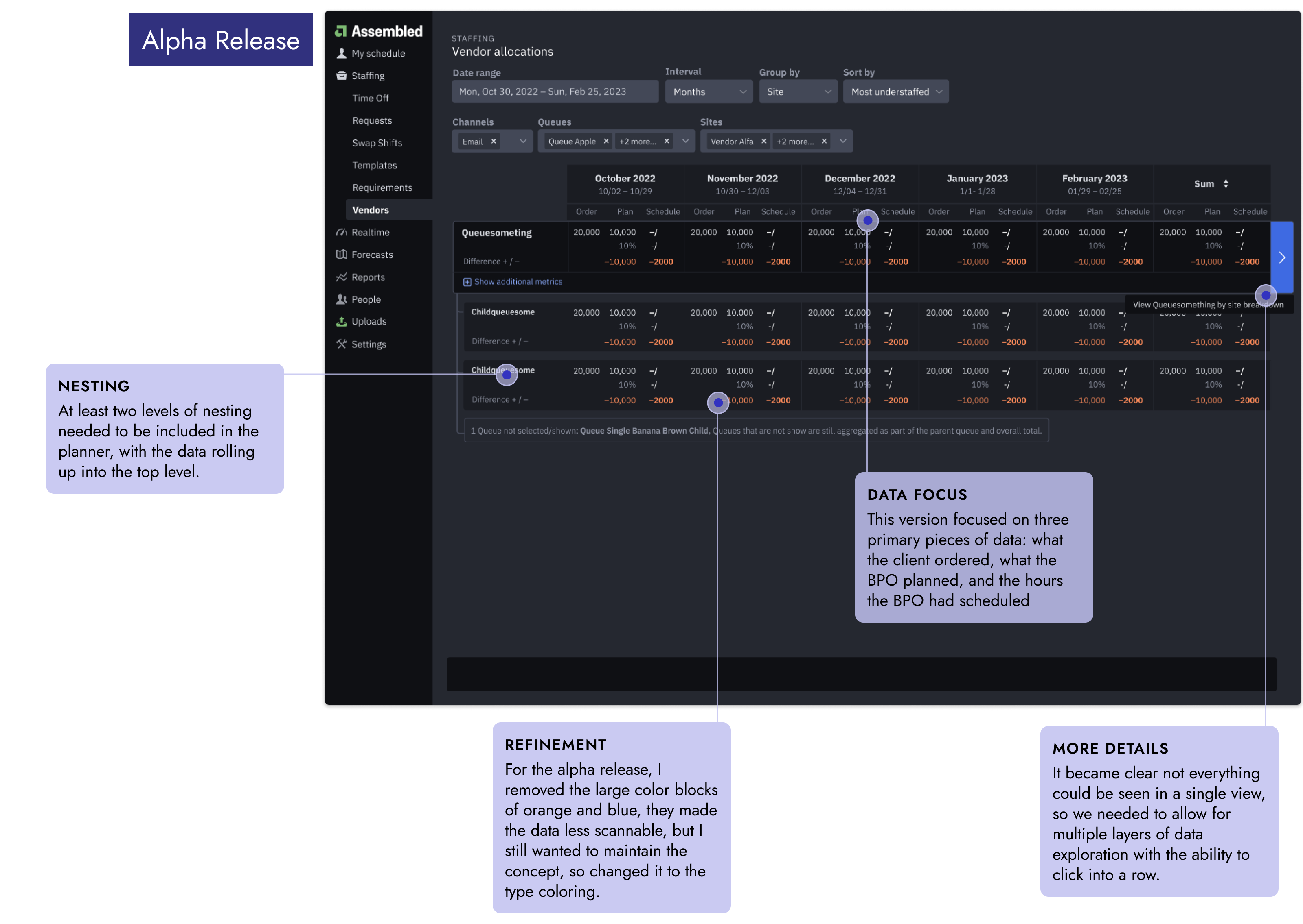
After the Alpha release deadline, we followed up with the Stripe team about what their needs were, but we didn't get much feedback. After a couple of weeks of meetings and researching their usage, we found that the Alpha release simply didn't have the right amount or types of data that different users needed.
I took a step back to really dive into the data points that needed to be displayed and compared by each user in the process, which directly influenced the layout of the table cells.
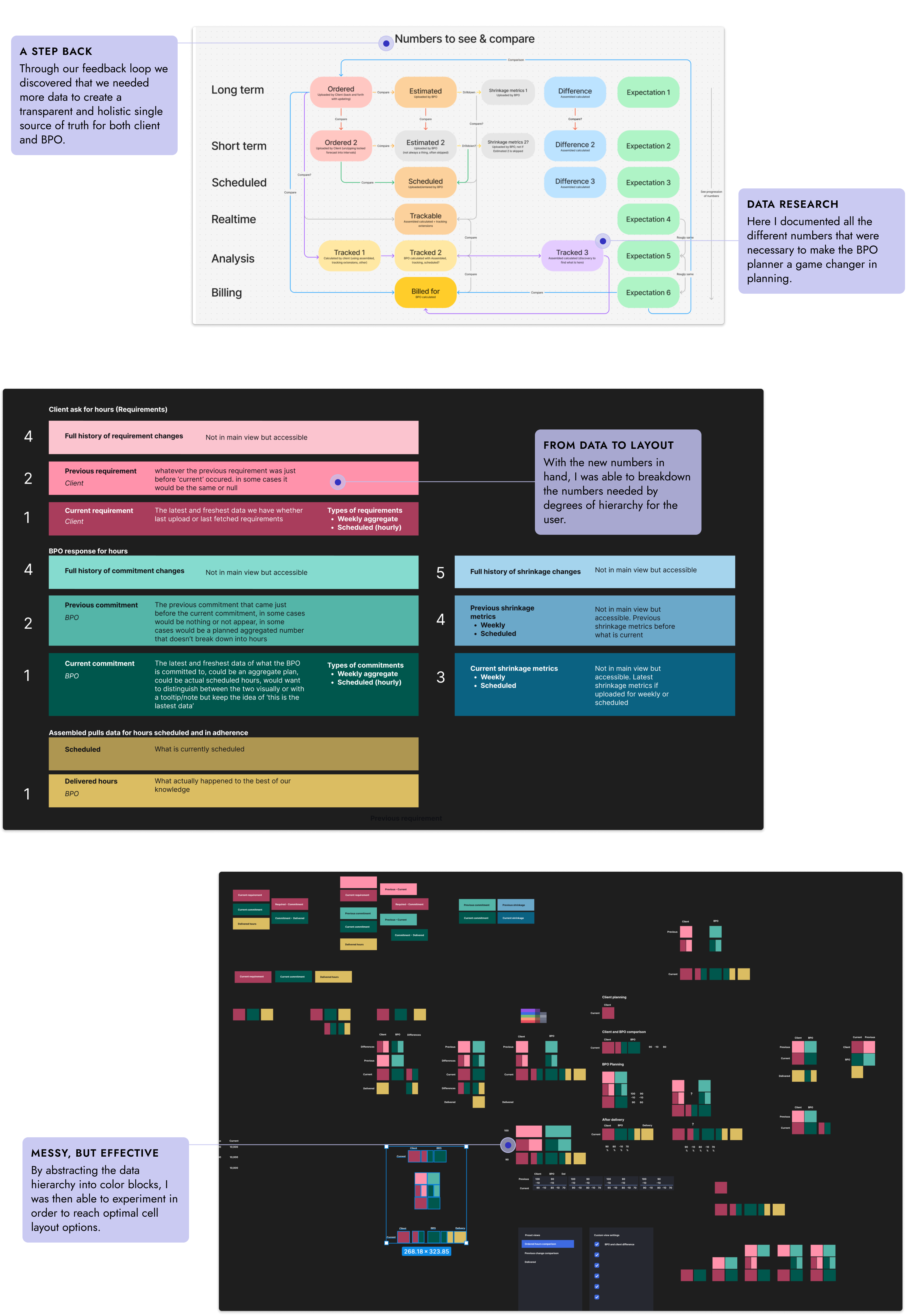
With this new take on the data, I built out a vertically scalable data view that focused on data density and flexibility.
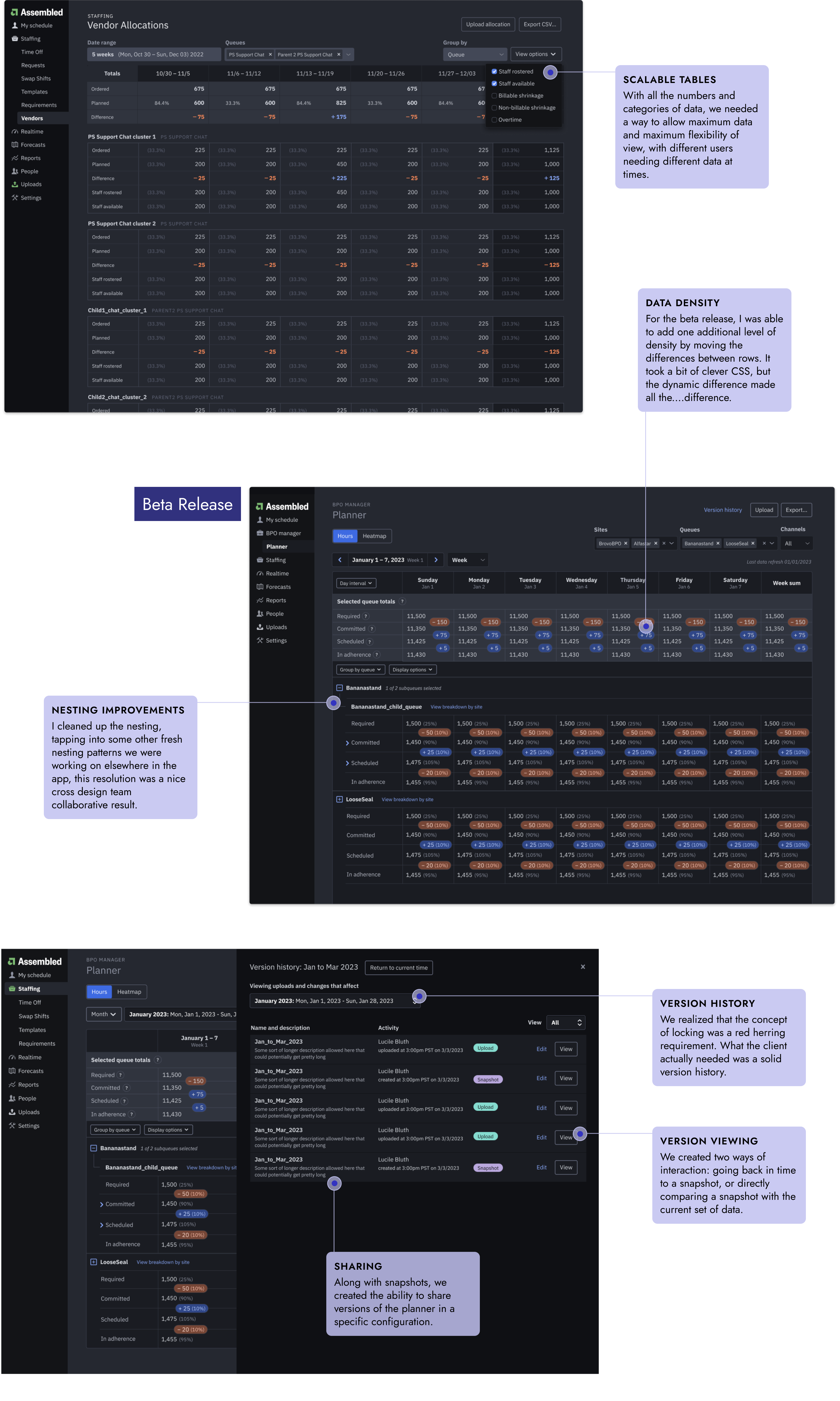
The Beta release proved much more successful, and this time we got much more feedback for refinement around the product, which went into the General Availability release.
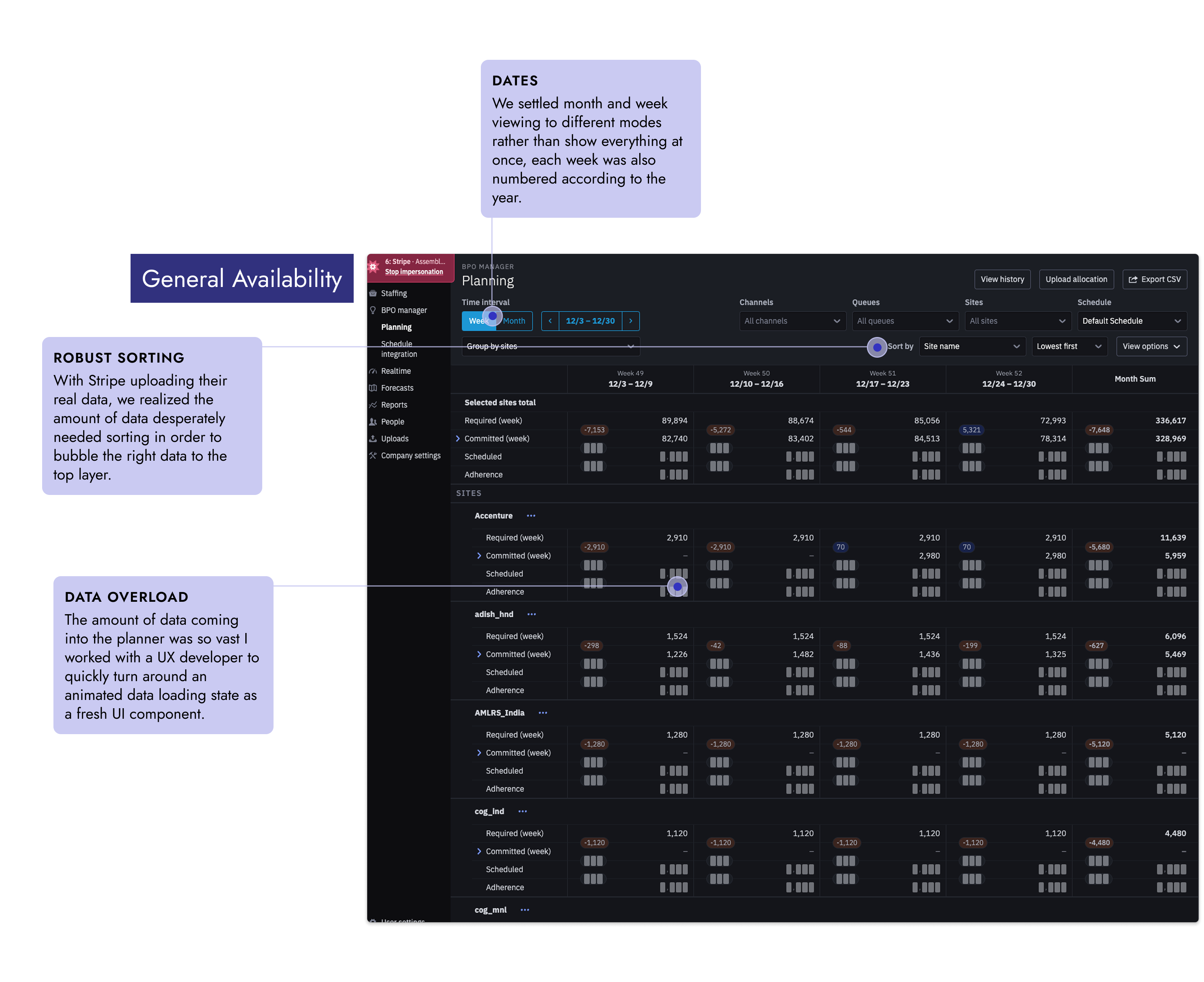
In parallel with development with Stripe, we had also partnered with Robinhood to fill out different aspects of the product to make it a marketable standalone product, and to develop future features.
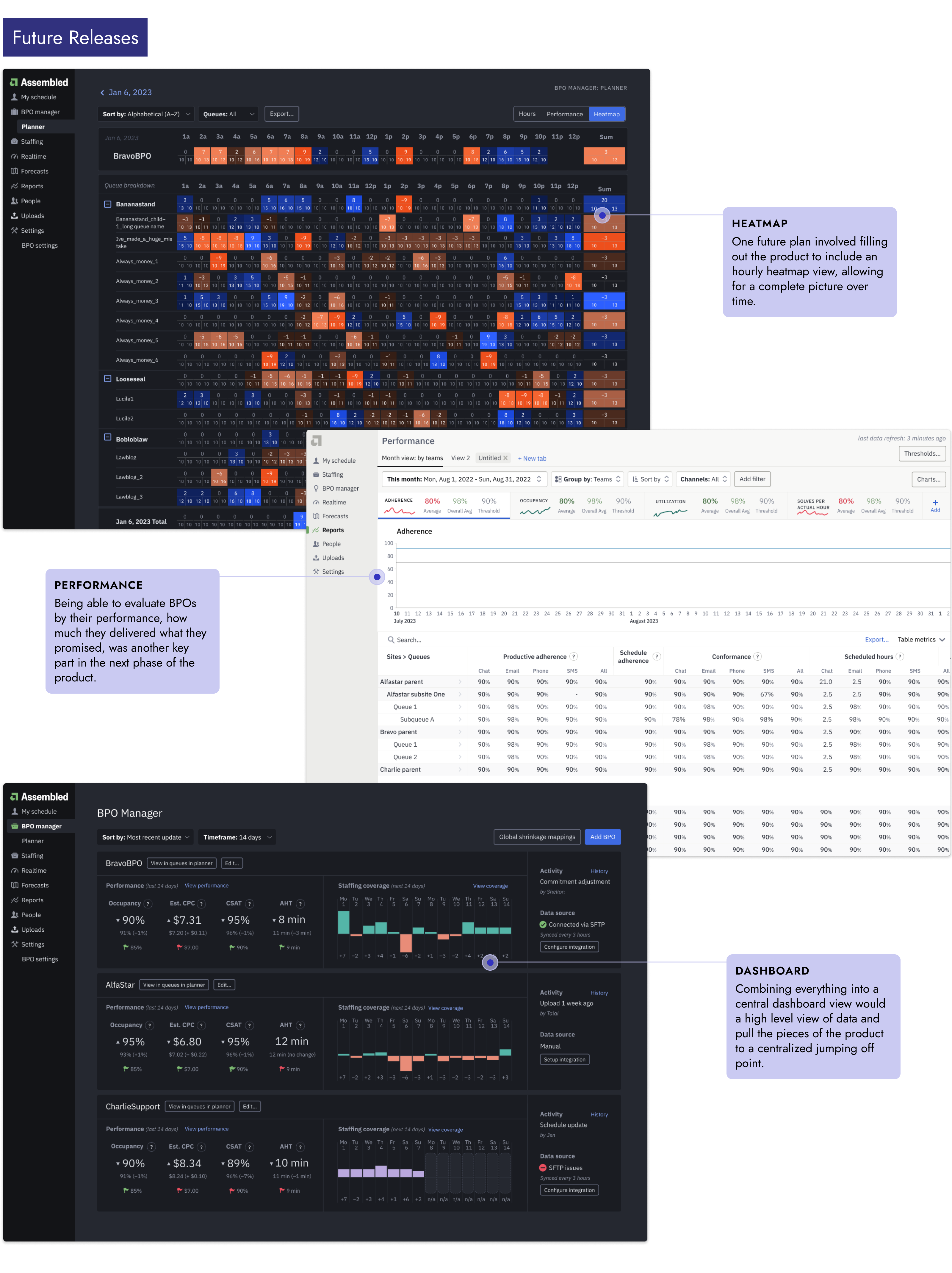
The BPO manager launched to GA with both Stripe and Robinhood fully onboarded and several other customers lined up. It also launched a new era of Vendor Management at Assembled, growing the product well beyond the scheduling functionality, and was a key selling point for pulling in even larger clients to work with like Salesforce.
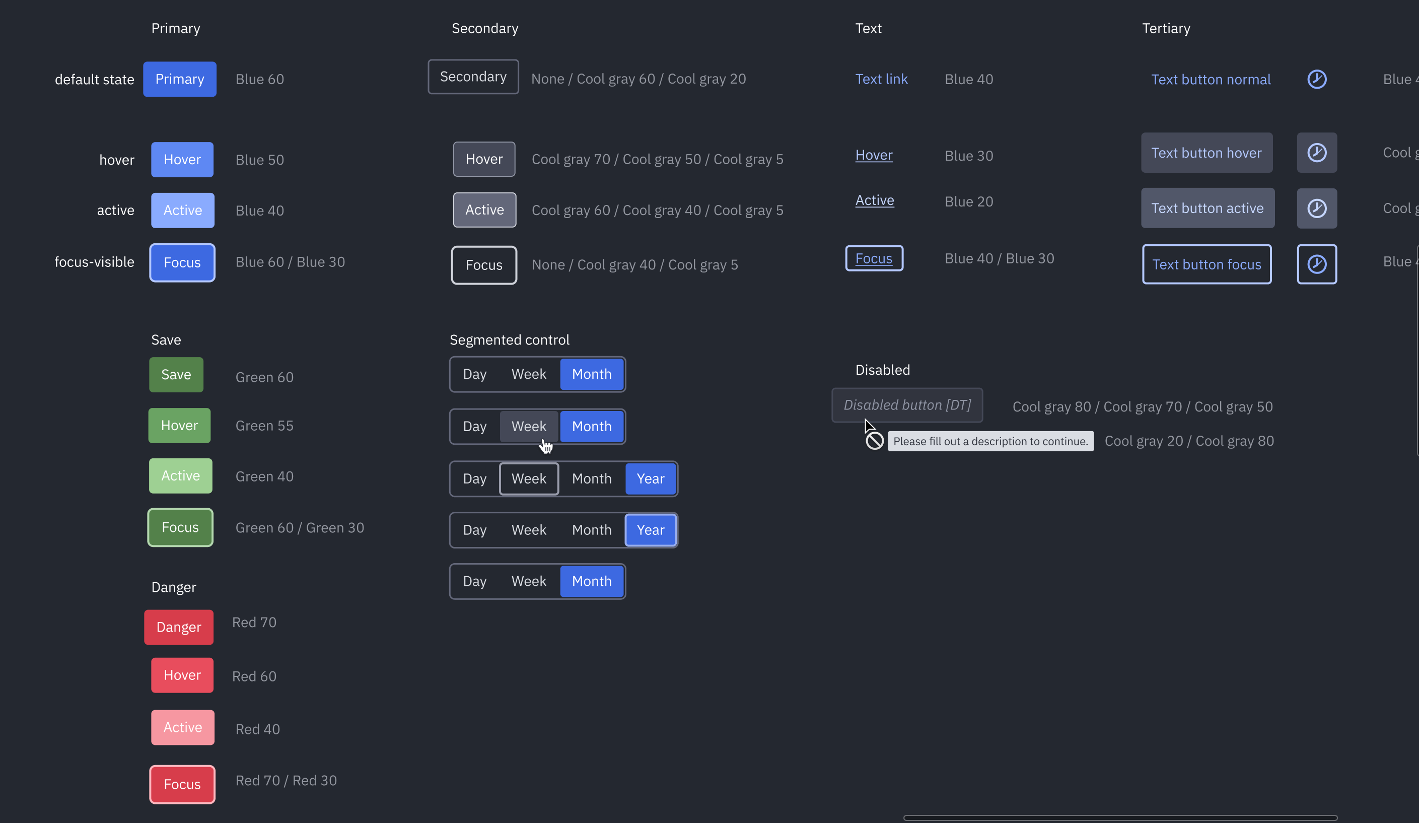
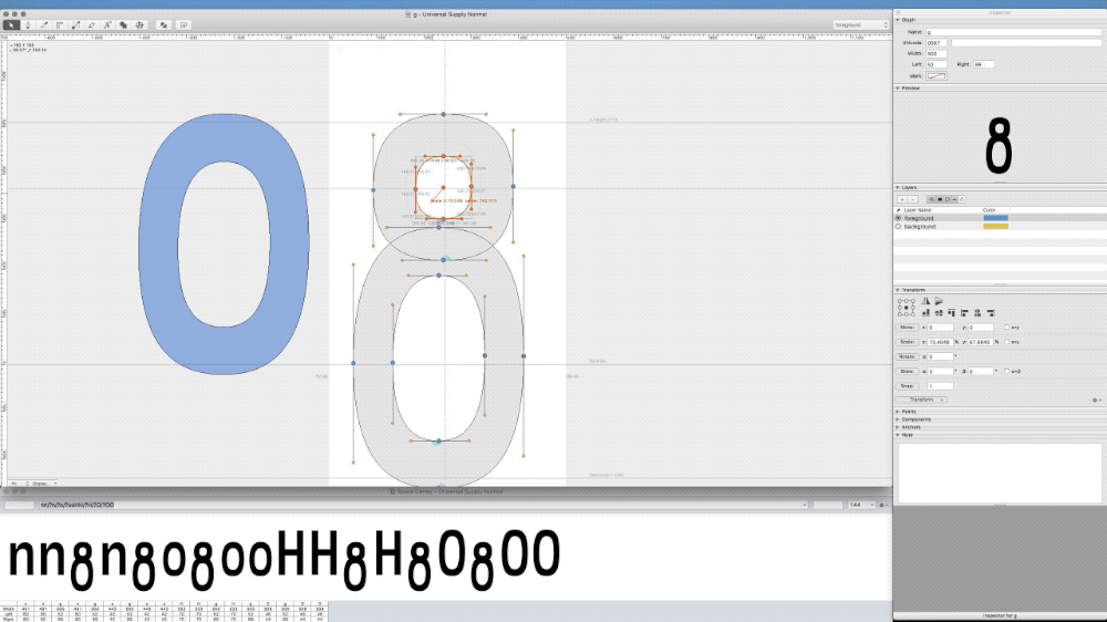
Design Stystem side dish
At Braintree, I kickstarted the very first design system, but at Assembled I got to use all of those discussion lessons learned. As the Chief Button Officer, I was often elbows deep in component configuration in Figma. Working closely with other designers and engineers, we were able to significantly move the product aesthetic to a more modern direction, and at the same time, create an organized, scalable, maintainable system.
Responsibilities
- Designer
- Organization
- Grunt work
- Accessibility
- Auditing
- Component building
- Chief Button Officer
Team
- 3–4 Designers
- 2–3 UX Engineers
- Head of Design
Product Impact
- Organized and streamlined scalable design system
- Created and maintained easy to use components for designers and engineers that match 1:1
- Helped standardize reliable color and typography systems
- Created consistency for end product, less overhead for designers, and faster implementation for engineers
Working on the design system at Assembled (Assemblage) was an ongoing and iterative process. We had overarching goals regarding consistency and working towards upgrading many legacy parts of the product.
There was no real established color palette when I started at Assembled, but over time we evolved the system to have a full palette of primary and secondary colors, tested for accessiblity.
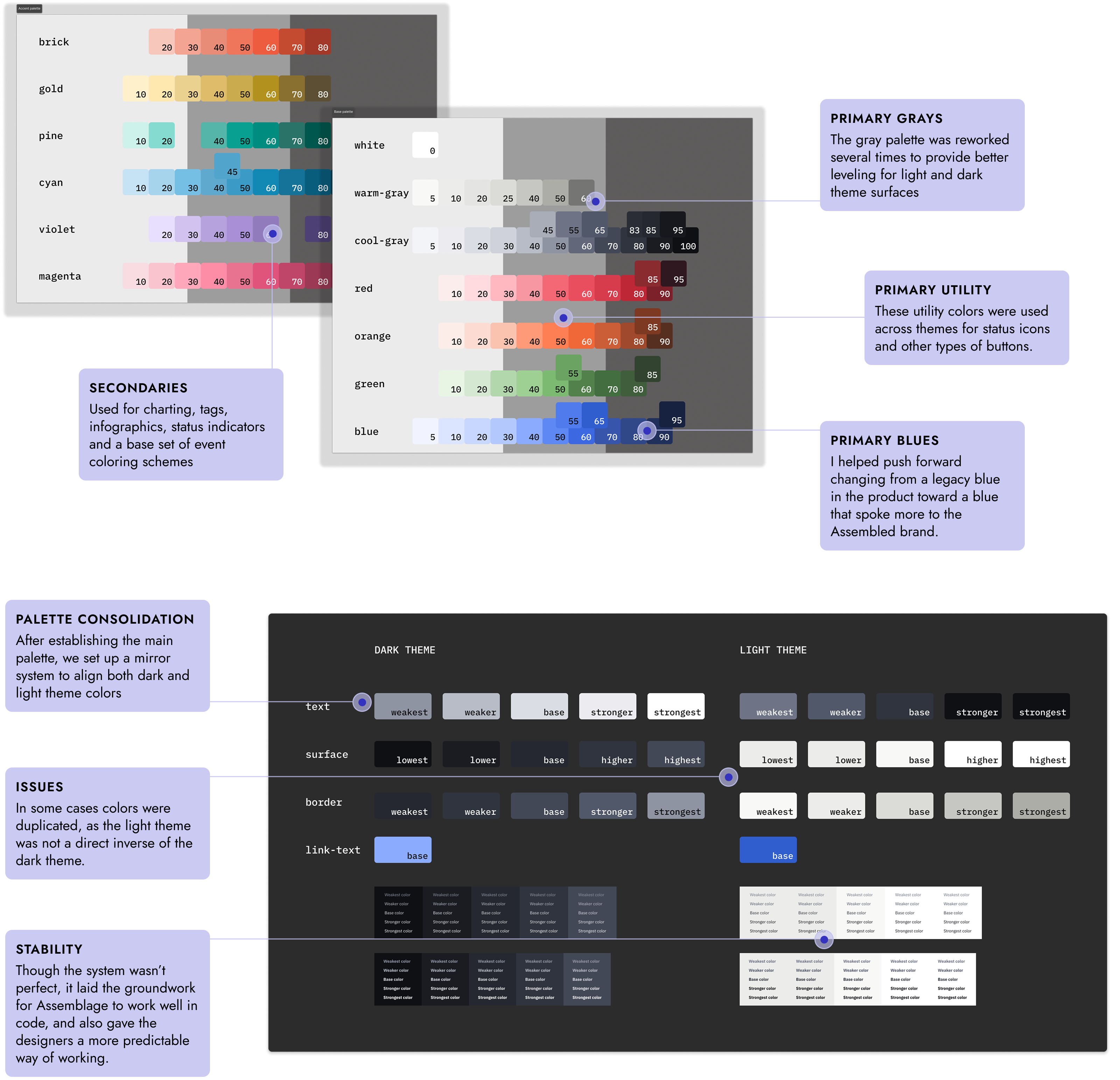
One of the biggest issues that we went through several rounds of revision on was the backgrounds of each application theme, dark and light.
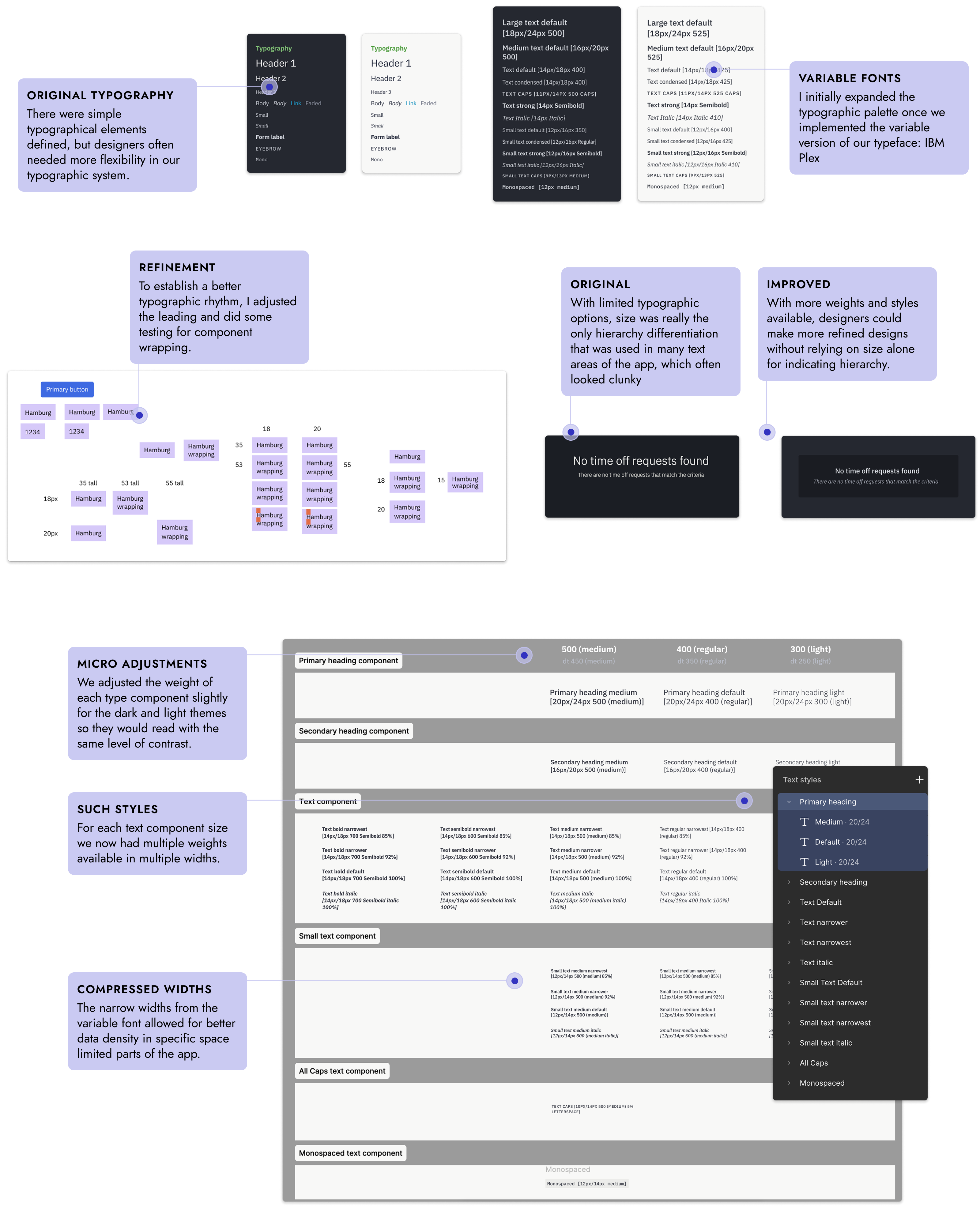
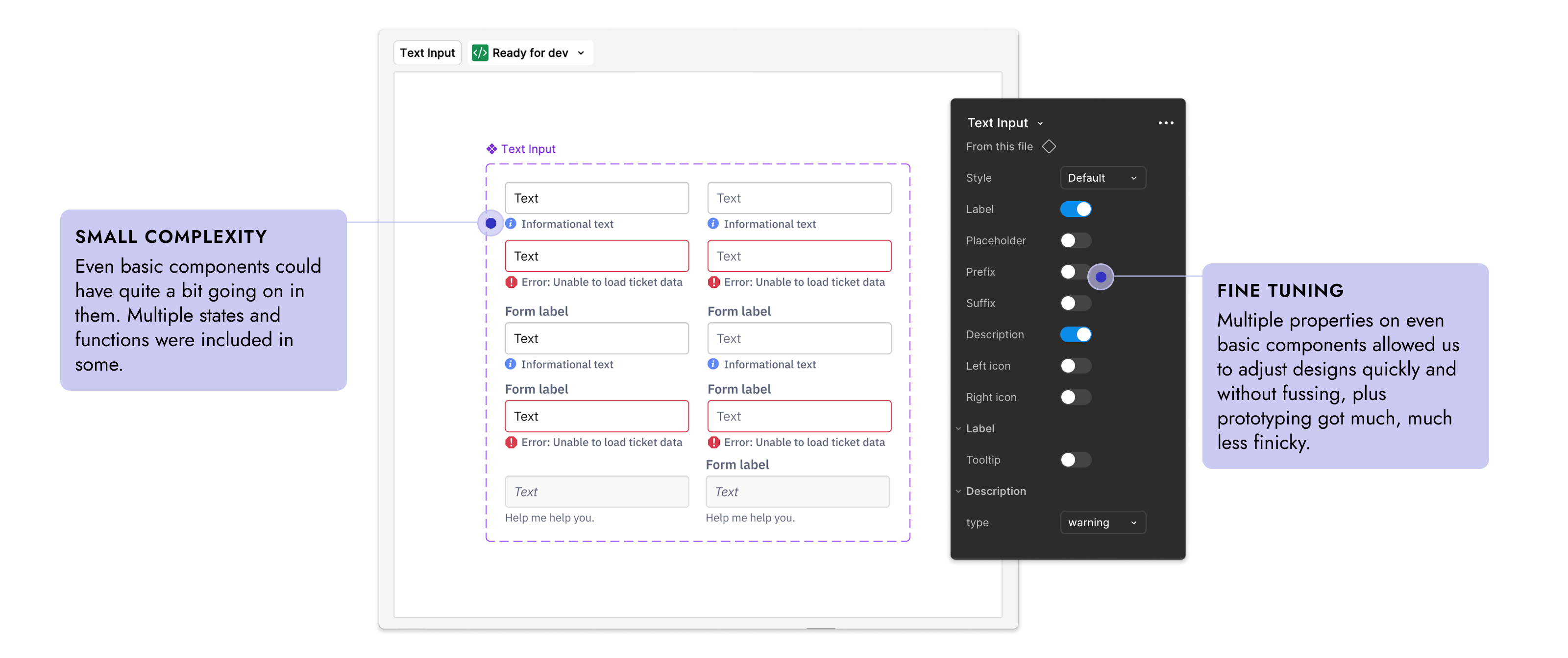
Beyond color, I also worked on dialing in the typographic system. There was a basic type system, but it didn't cover our needs, and it wasn't quite scalable or flexible. I revised the system so that designers had access to multiple different standard weights and sizes and we upgraded to a variable version of the typeface.
Buttons are one of the most common components, but we had very little consistency in the app around them. One of the first things I did as a system audit to understand areas that needed work.
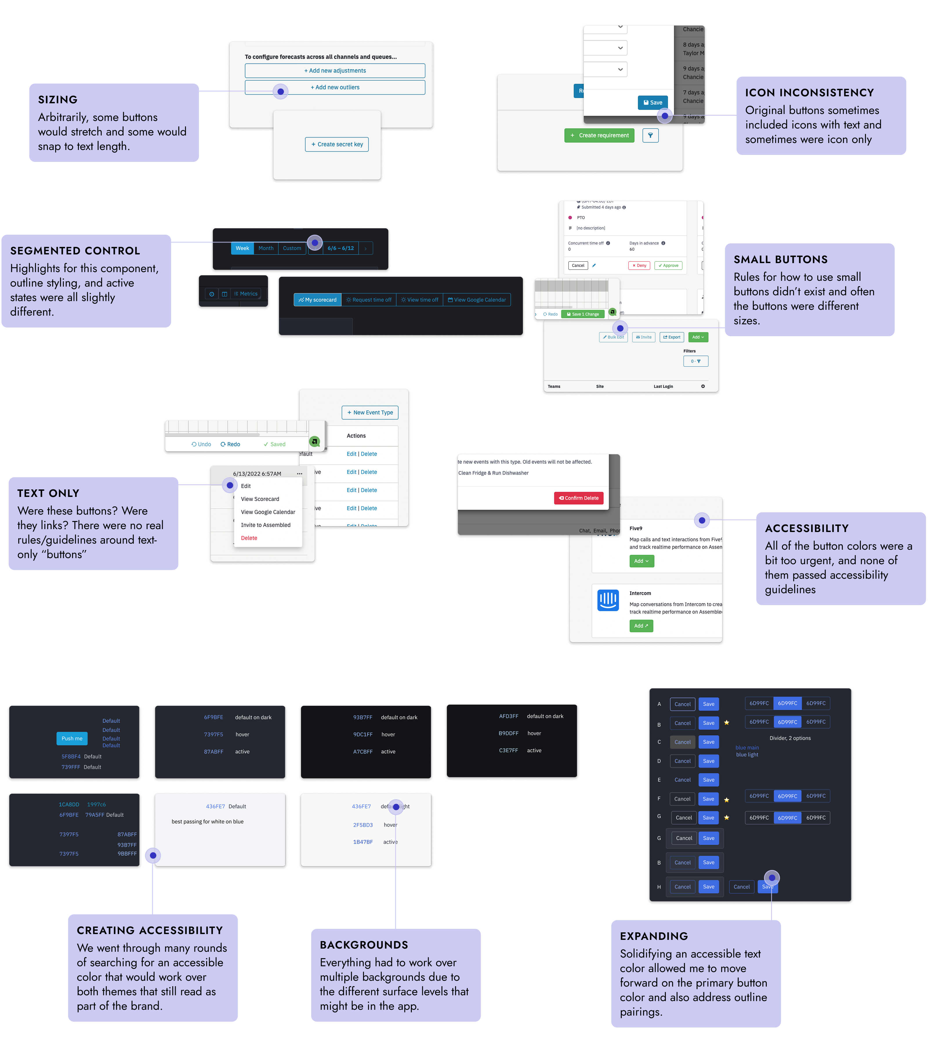
All the button work dovetailed with the color work, and each piece informed the other. We wanted to move towards closer branded colors, but also needed to maintain accessibility standards along with all the different states of buttons.
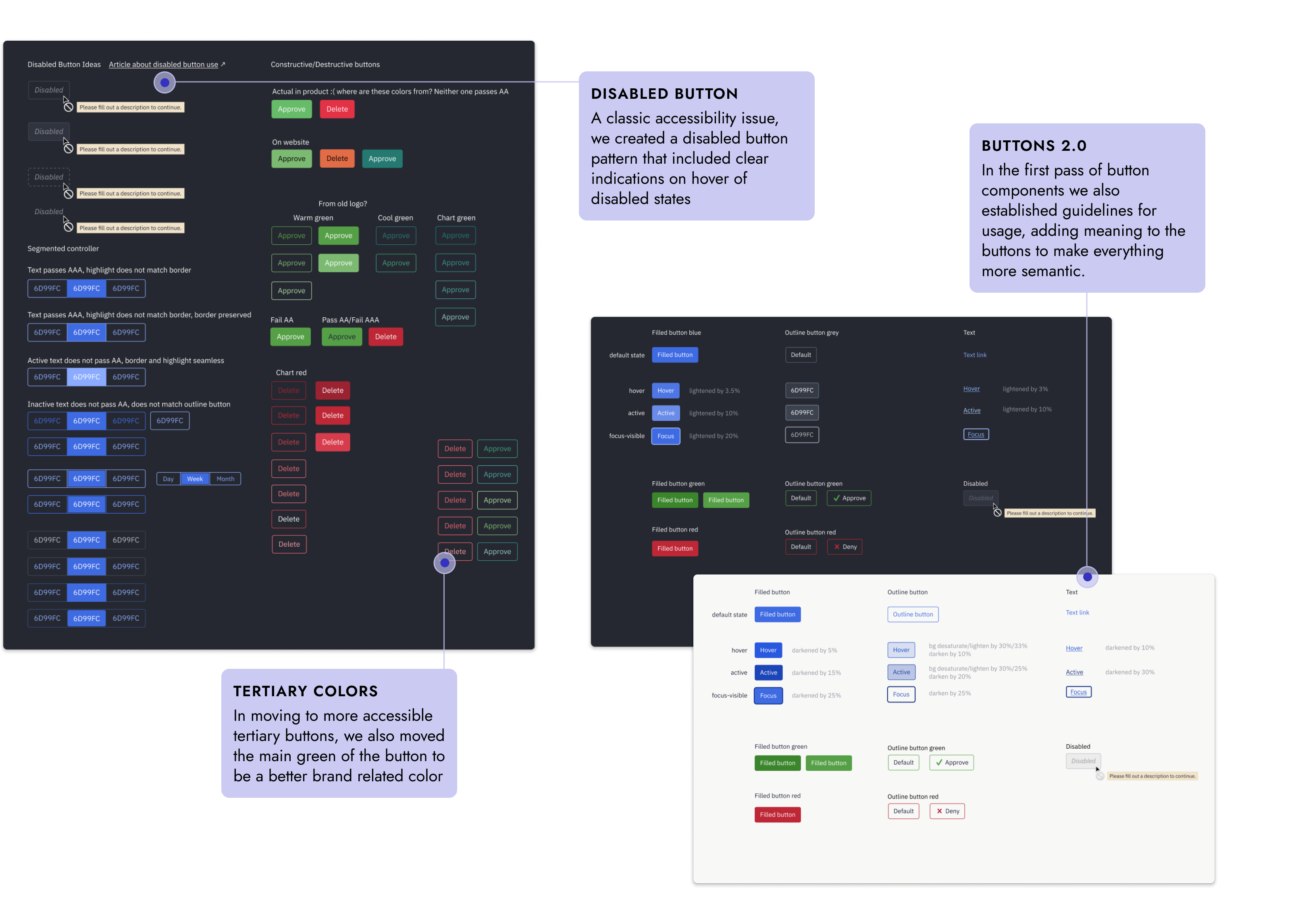
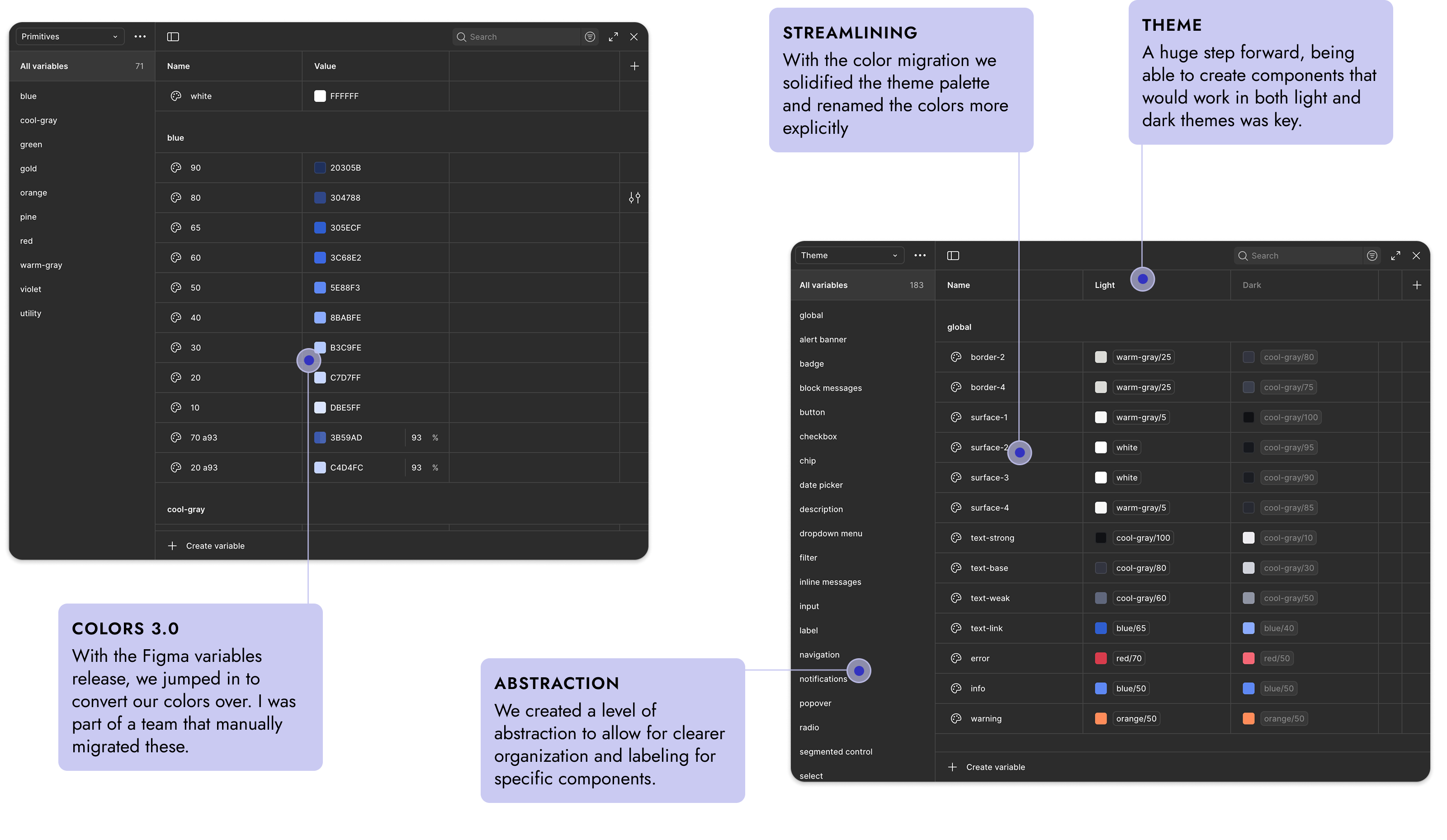
As the system evolved, so did the actual Figma components. We were able to continually update the system to the newest features in Figma components, finally getting to a point where with Figma variables we could create components that worked automatically in both light and dark themes.
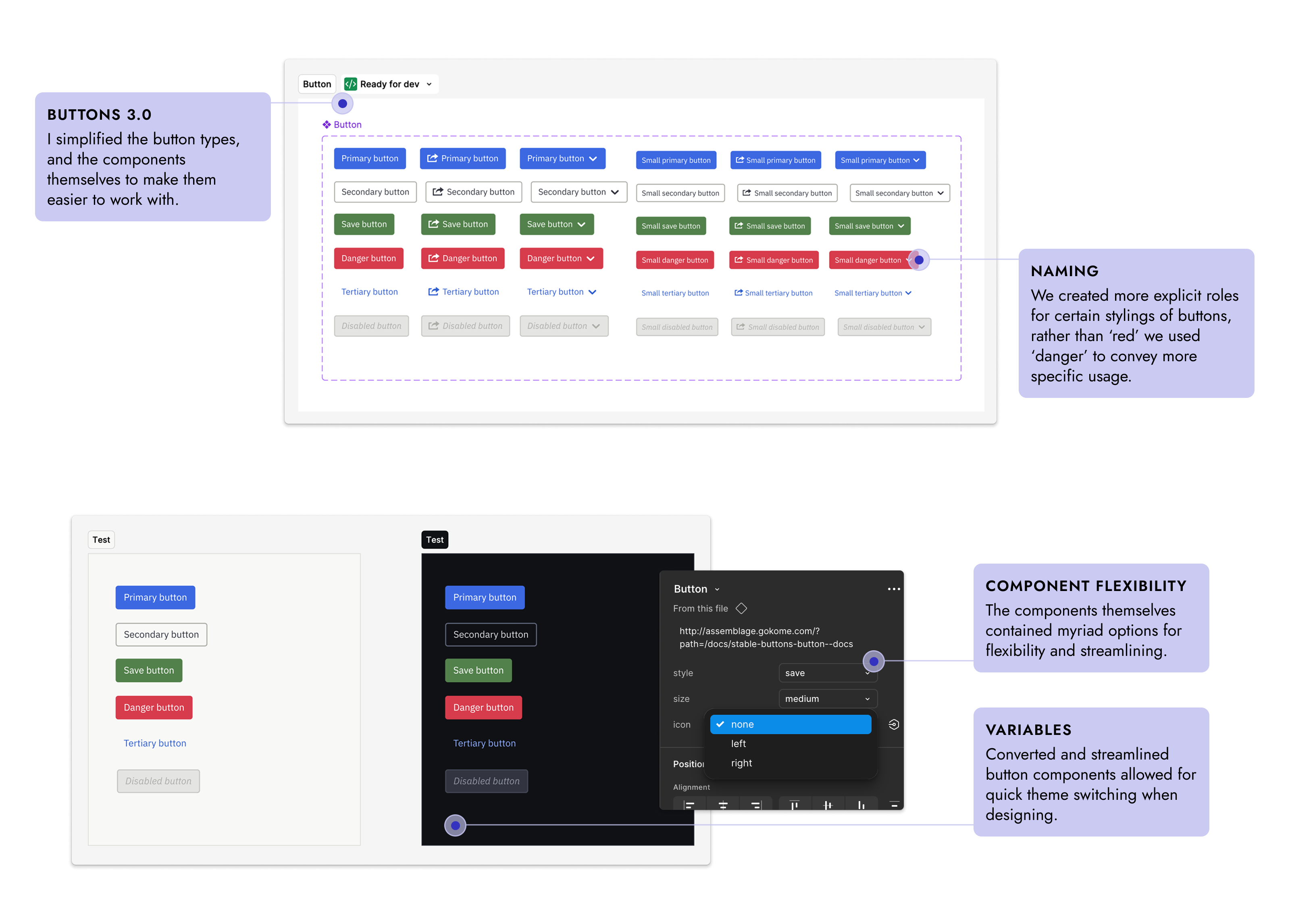
Once we had an established baseline for things, we had a lot of upgrade work to do for the actual components themselves.
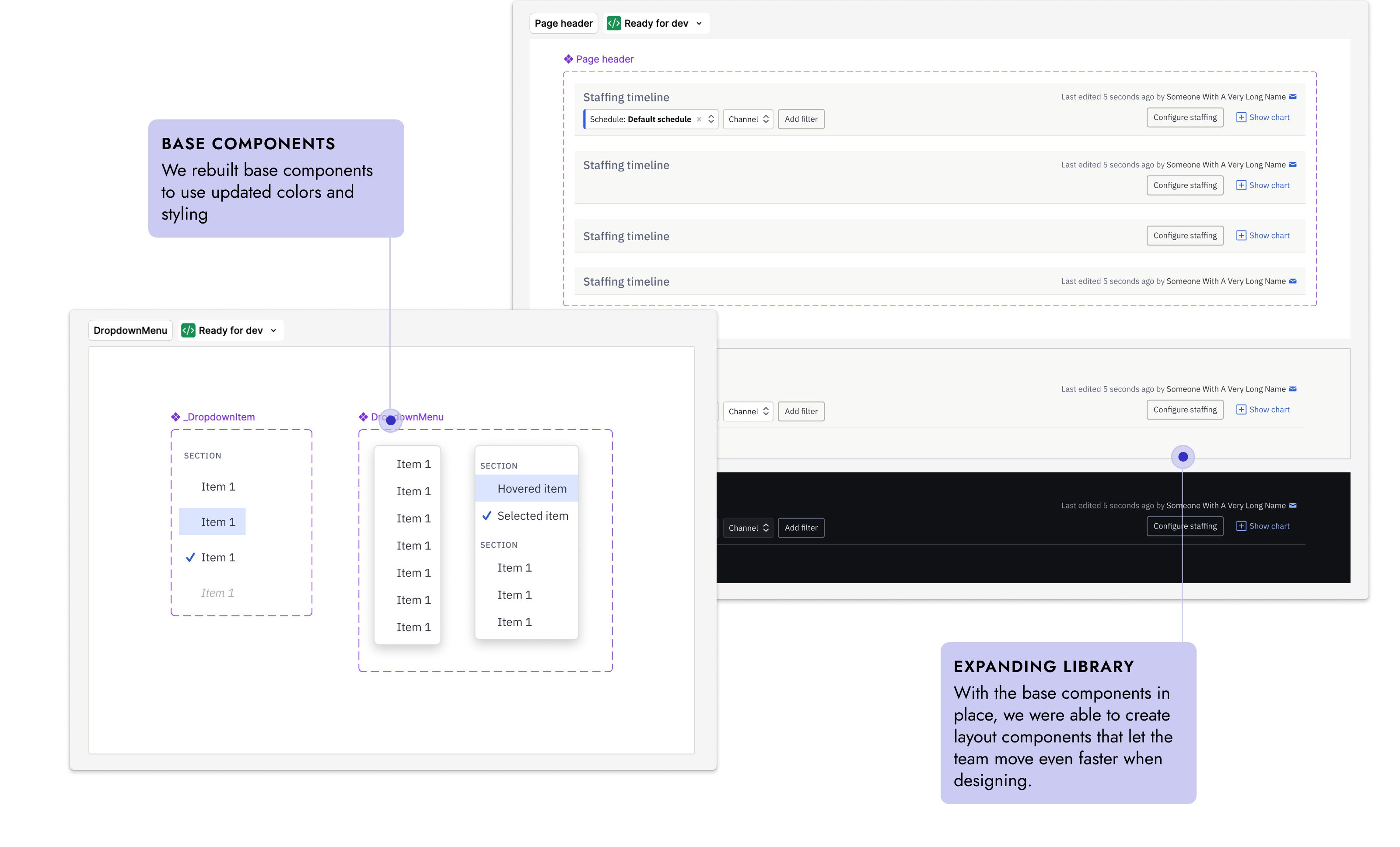
Assemblage came a long way in my time at Assembled. Initially, all we had was a single page of inconsistent components, and in my time there we moved from that to a robust Figma library that could handle multiple themes, and a matching 1:1 code repository for developers to copypasta. So much design is discussion based, and though I pitched in a lot of grunt work to get a robust design system in place, the conversation itself always informed the development of the system.
Miscellaneous Sweets
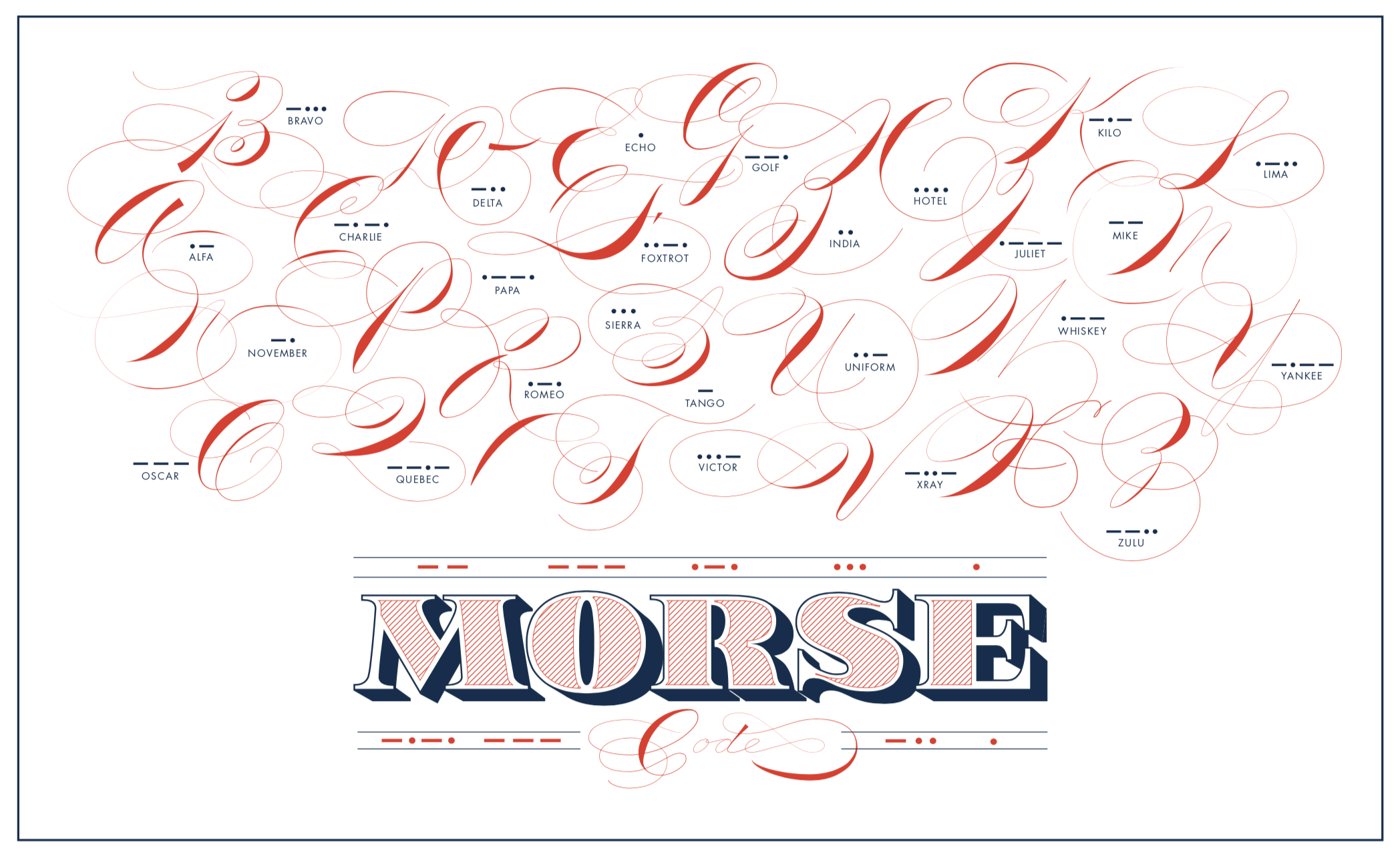
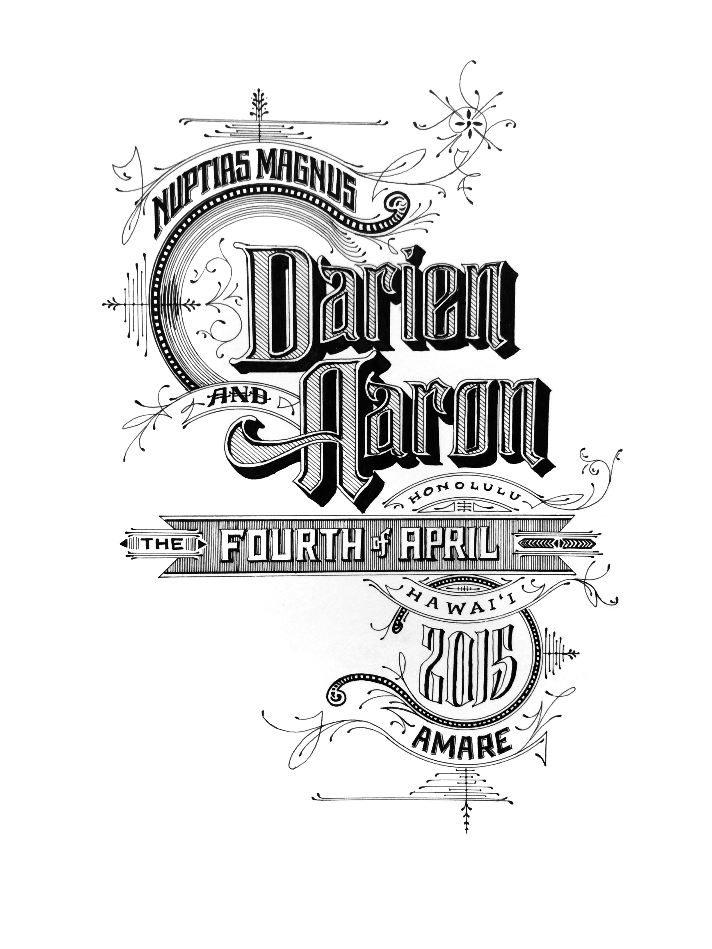
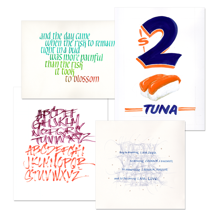
I have completed two certificate courses for type design, and one for calligraphy, along with many lettering and signpainting workshops. Here are a few snippets of projects over the years.

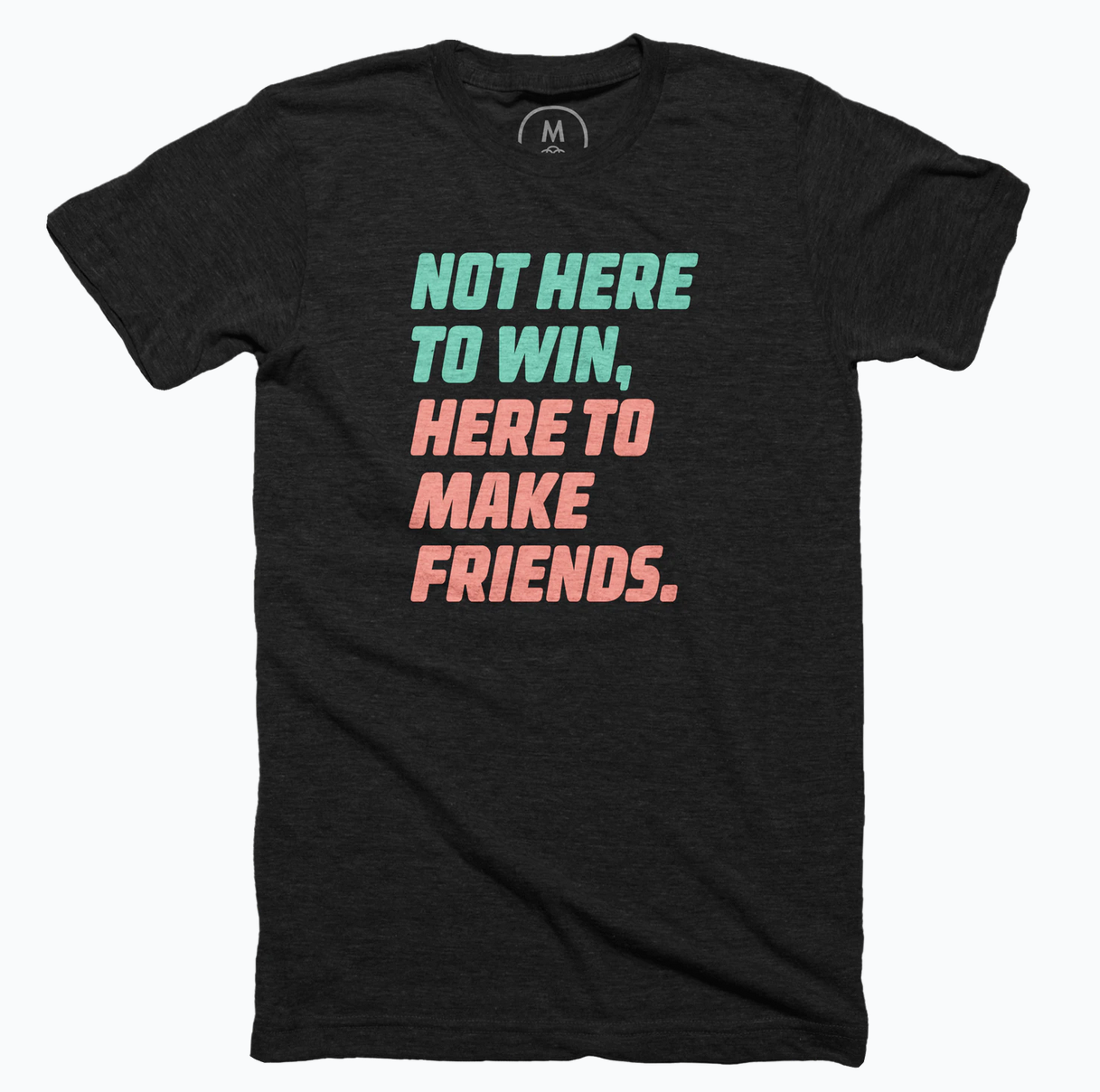

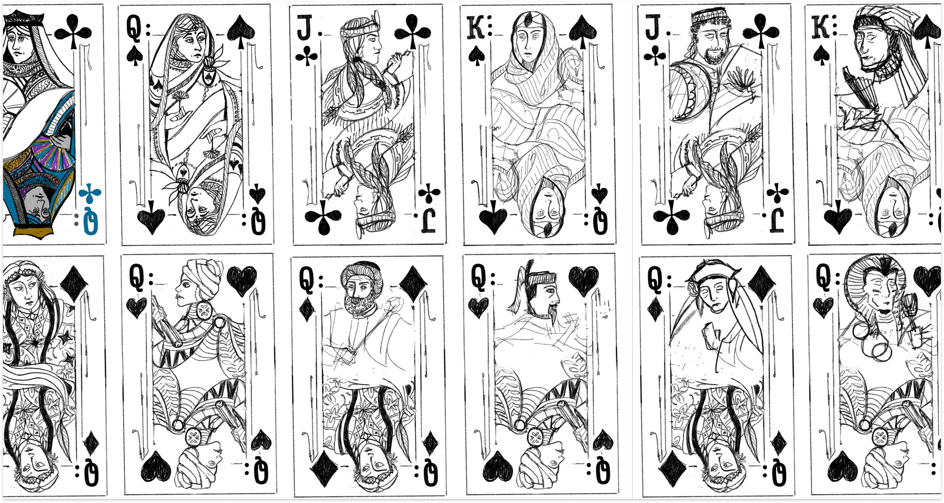
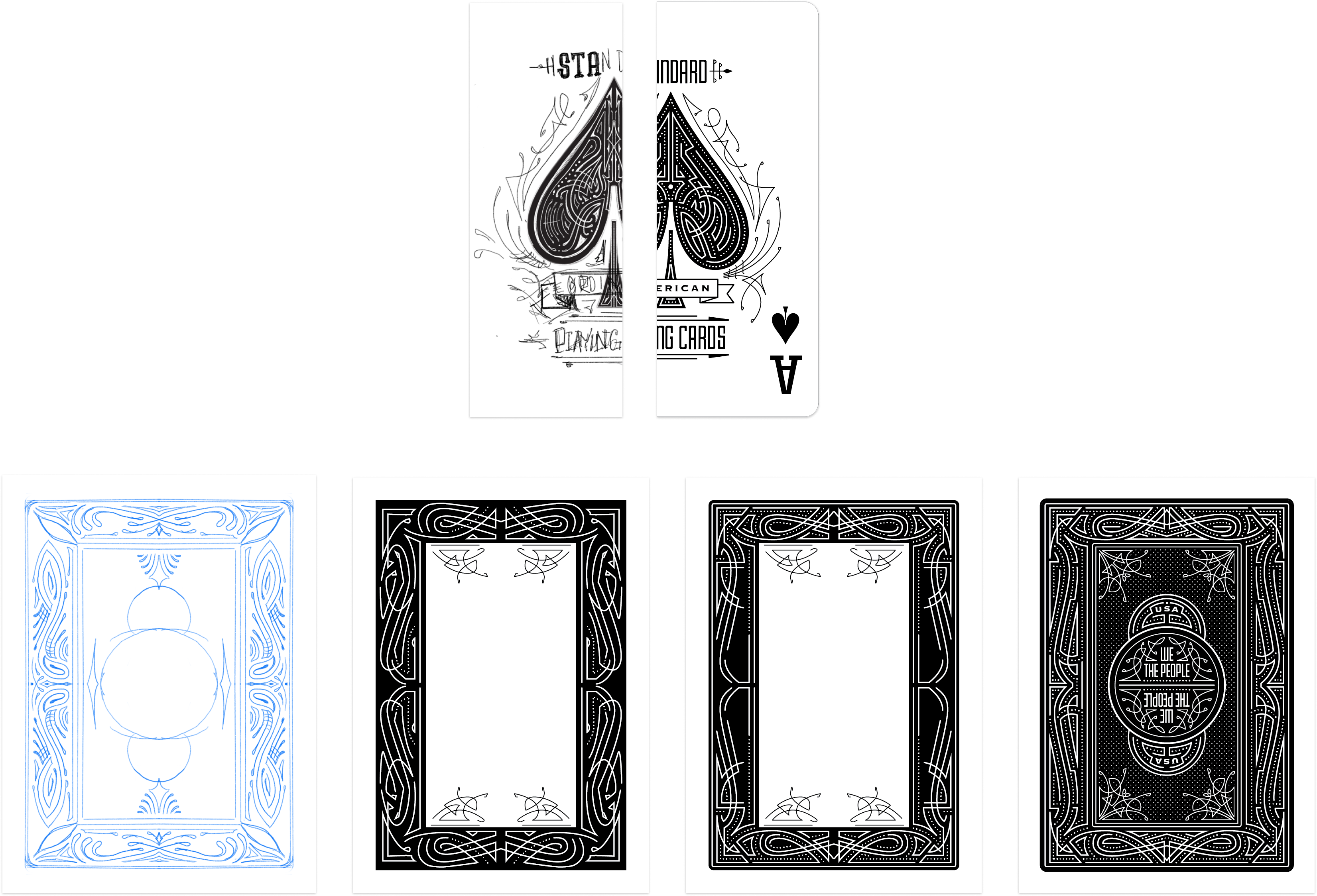
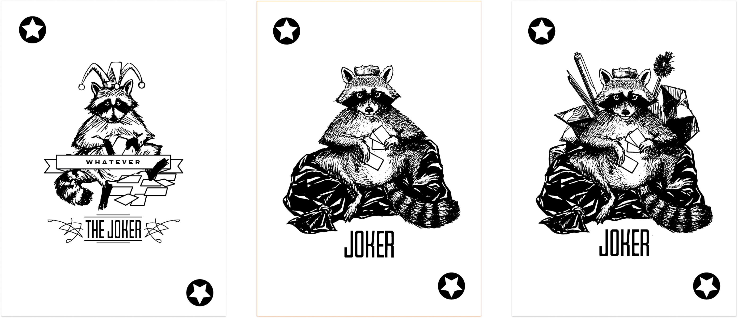
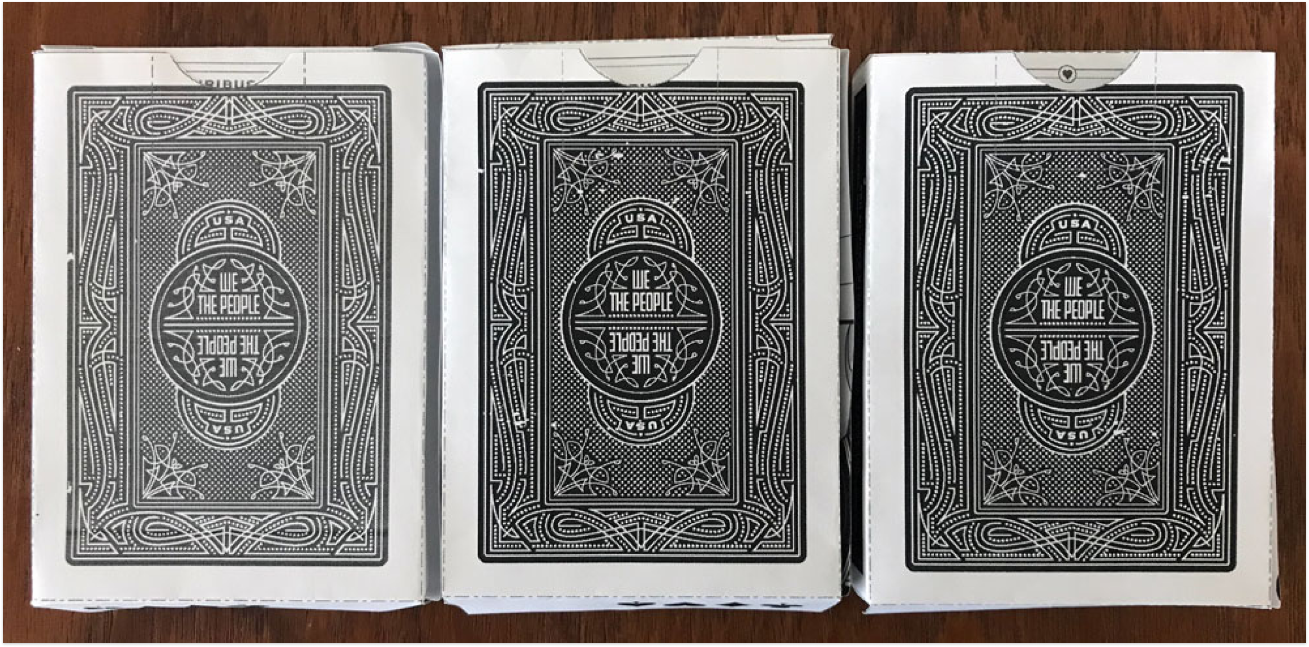
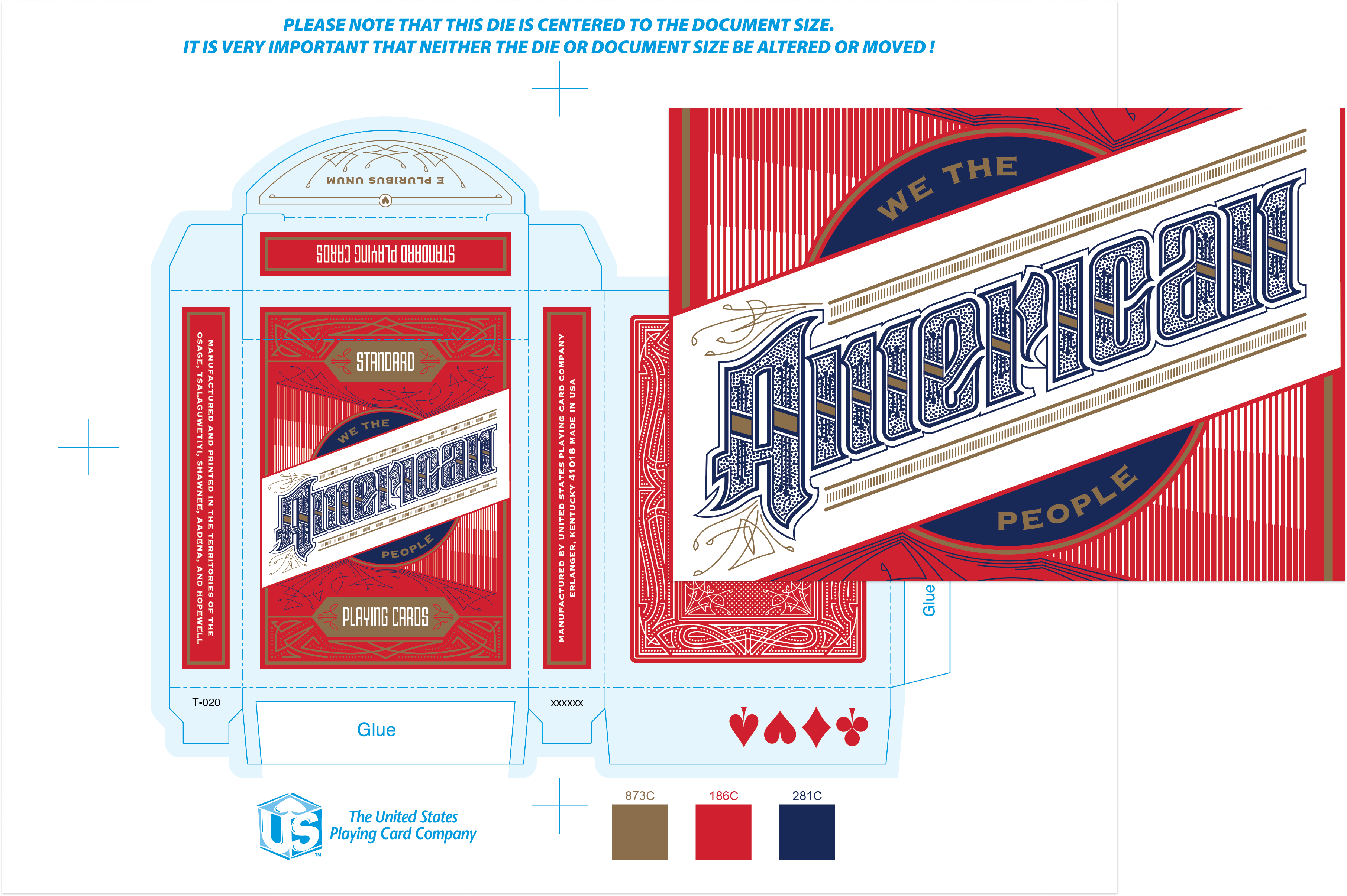
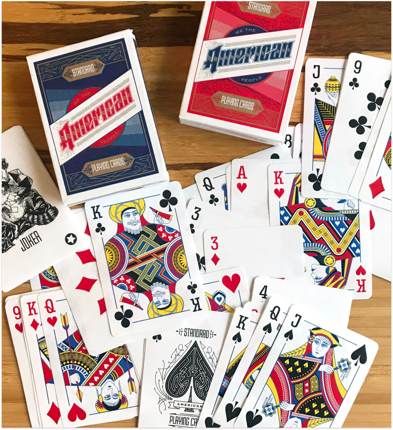
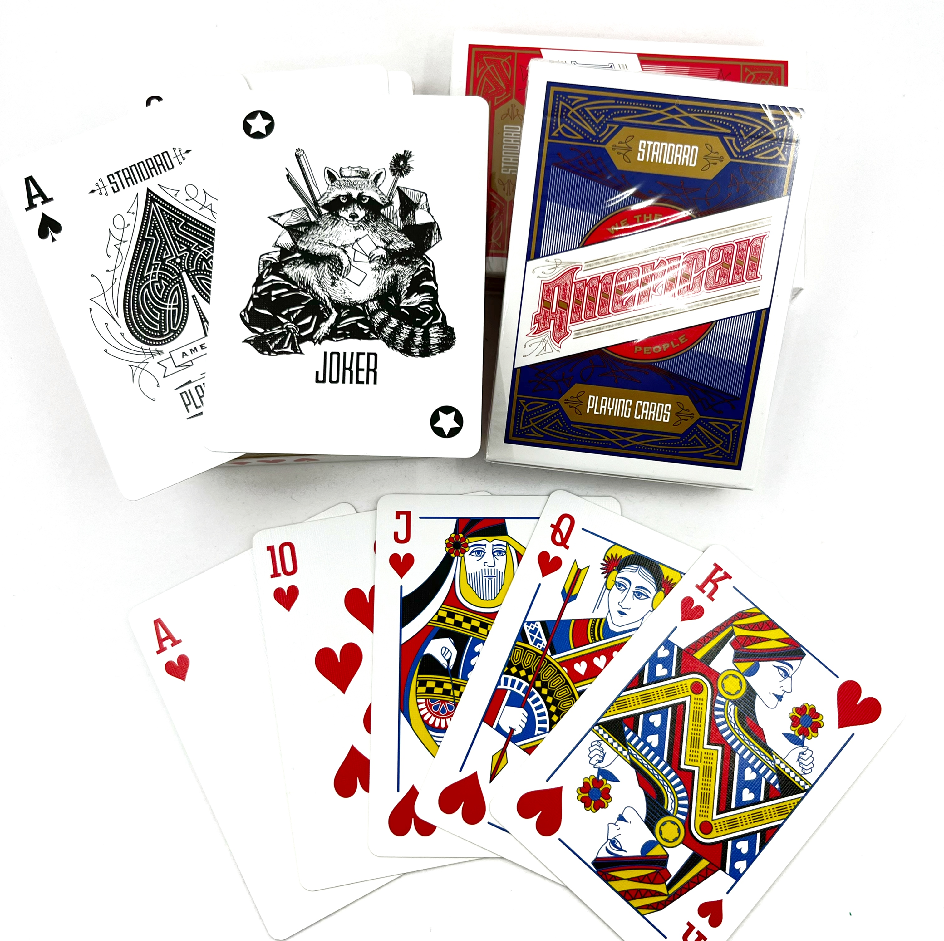
Standard American Playing Cards
American Standard Playing Cards was a two year personal project that allowed me to flex my type, lettering, illustration, and system design skills. I loved putting thoughtful details into every piece of this small object, down to the stickers closing the box.
Responsibilities
- Solo designer
- Conceptualization
- Illustration
- Custom lettering
- Print production
- Distribution
Team
- Just me
Product Impact
- Printed an offset run of 3,000 decks, donated most of them to youth shelters in every state
- Got some very nice thank you letters
- Intangible? Immeasurable? Hard to measure what representation means to someone who doesn't often see themselves in other things
These cards started as a side project as I was learning to play bridge at work lunches. I thought it would be really nice to create some custom playing cards for our group, but I had no idea it would morph into something so much bigger and more fraught.
I'm sure you've seen these before, just some generic playing cards. I tried to think of how I could make mine unique, but what I started to realize was just how pathetically Eurocentric the 'default' set is.
Every project I do, I approach from a product angle. I spend a lot of time conceptualizing and refining that concept, researching and trying to figure out the core of the project, doesn't matter if it's a deck of cards or a payment product.
I started to sketch with better representation in mind, and it got complicated and confusing. I struggled with making them different and obviously diverse, but at the same time trying to maintain the "traditional" aesthetic, in order to serve as a straight replacement, potentially without anyone really noticing.
Adding the patterns and coloring for each card and making them consistent with one another, but still unique to each face card required so many revisions and sheer willpower to keep going. I iterated and iterated on the face cards and kept refining the patterns. There's a lot of back and forth and trying things out, testing things together and letting go of certain parts that just don't work. As in my regular product design day job, I know through iteration that each version will bring me closer to the aesthetic that's in my mind.
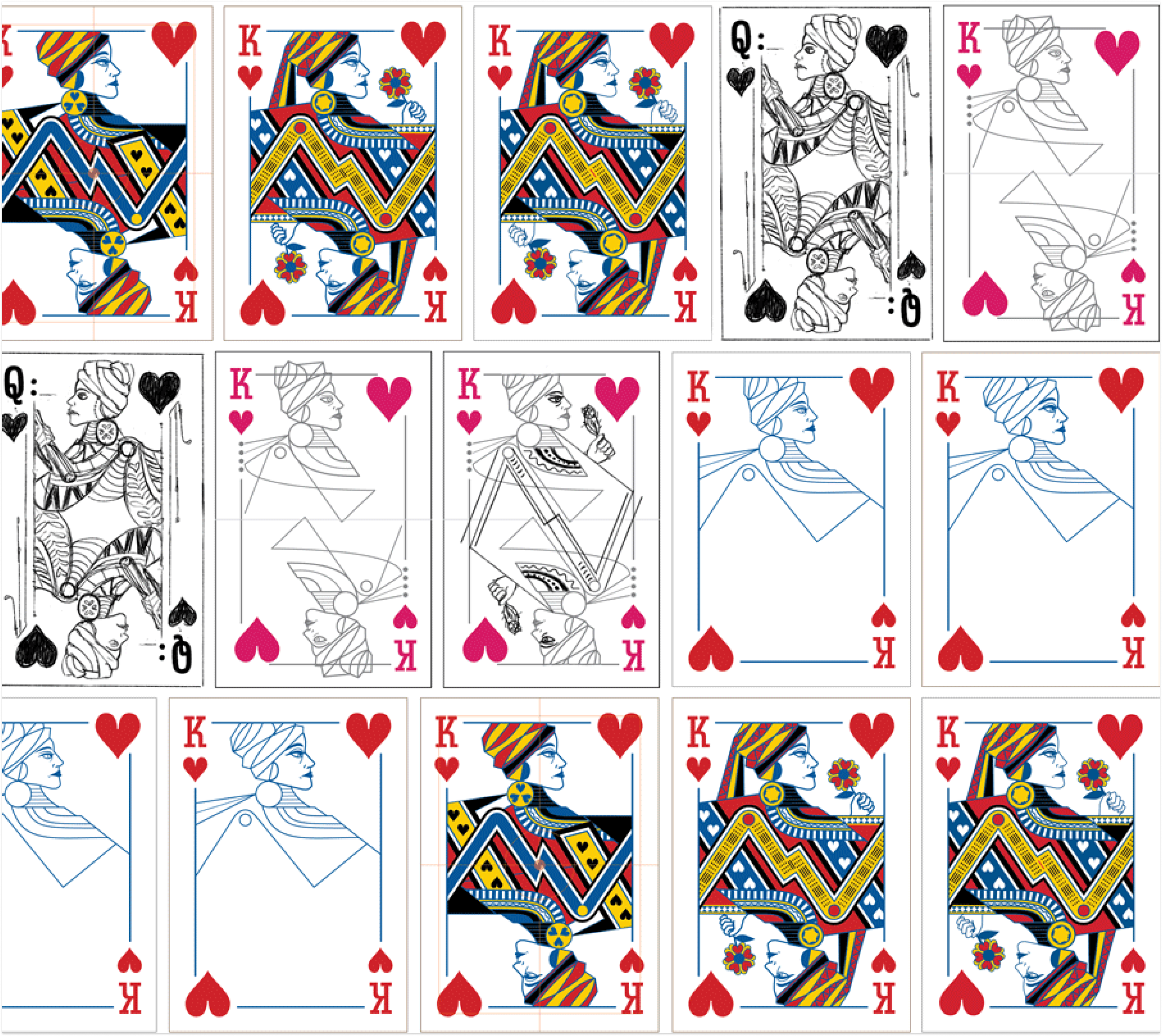
I did a fair amount of design system creation, making a custom typeface that included the suit pips and the numerals/letters. Every deck needs the same consistency in its design system to work together as a whole but still allow for easy differentiation.
Sometimes with a design system, I'll take an idea or a sketch like this ace of spades, and the first sketch or idea will almost nearly end up to be the final.
Then, the challenge becomes trying to get that idea to mesh well with others and apply it to other areas of the product effectively in order to grow the system and make a cohesive product.
There's always room for refinement and growth and one of the hardest parts of design is knowing when something is really done.
There's a user interface for physical products, and when designing for print that always needs to be taken into consideration. The way things face or sit on a 3D object and considerations when designing are not so different from anticipating user needs on a web form.
You can sure as hell bet when you go to print there's some damn user testing and prototyping, too. In many ways, 'go to print' is so much harder and irreversible than 'ship it'.
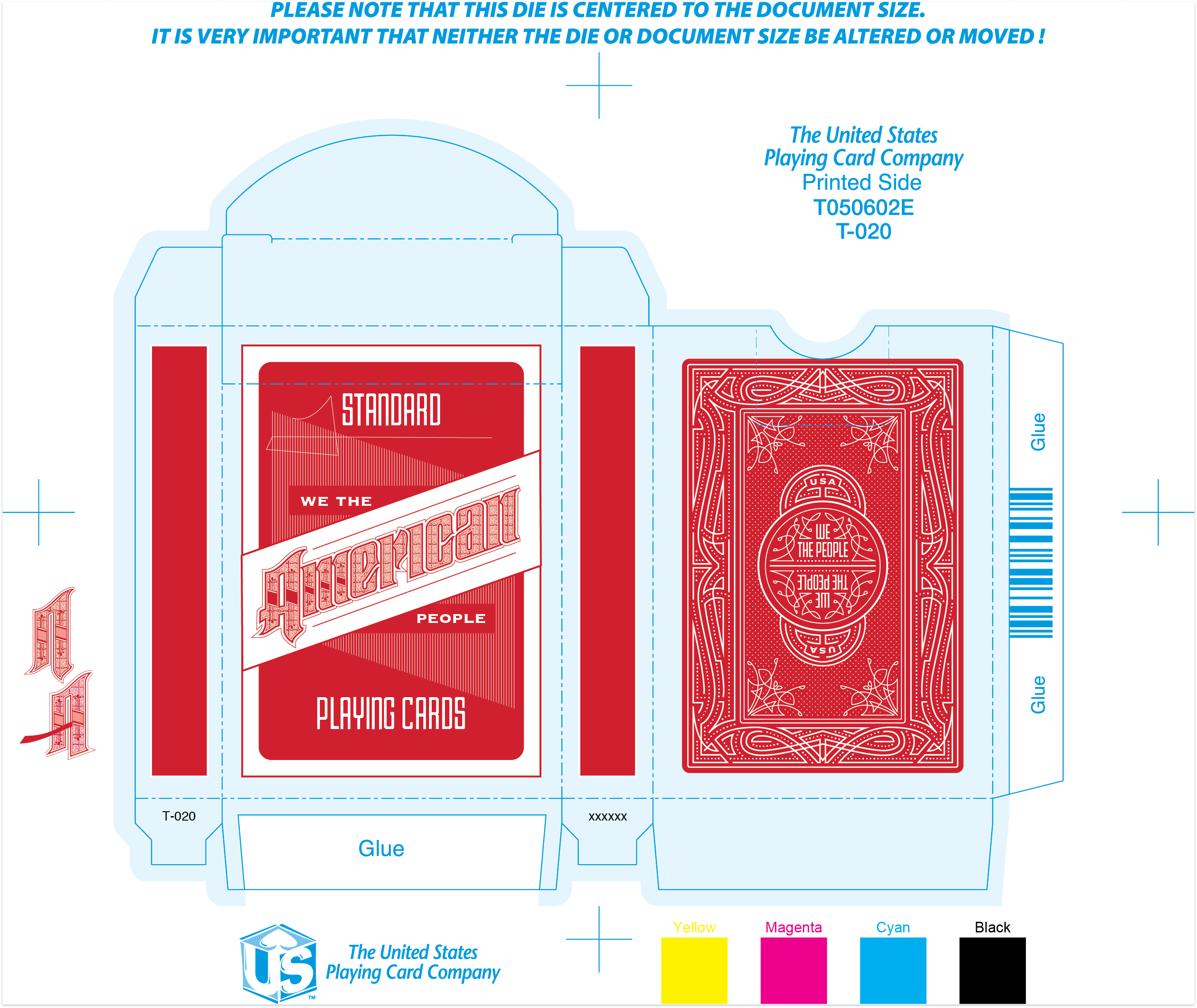
The same sort of detailing and thought goes into these decisions and how interactions work whether it's the lettering on a deck of cards box or the pixels on a credit card icon.
I aim for the same level of thought and care with any design I do, regardless of the qualifier of graphic, UI/UX, product or who knows what else they're gonna come up with next.
And, if you're curious, you can read a thing I wrote about the struggle of it all, because writing is an invaluable design skill, too.
The project began as a redesign exercise to make some cool new cards, but ended as a philosophical design exercise that challenged and used all my skills. I struggled with the concept quite a bit, and though I completed them in 2020, the conversation they are involved in feels even more applicable today. Buy a deck!